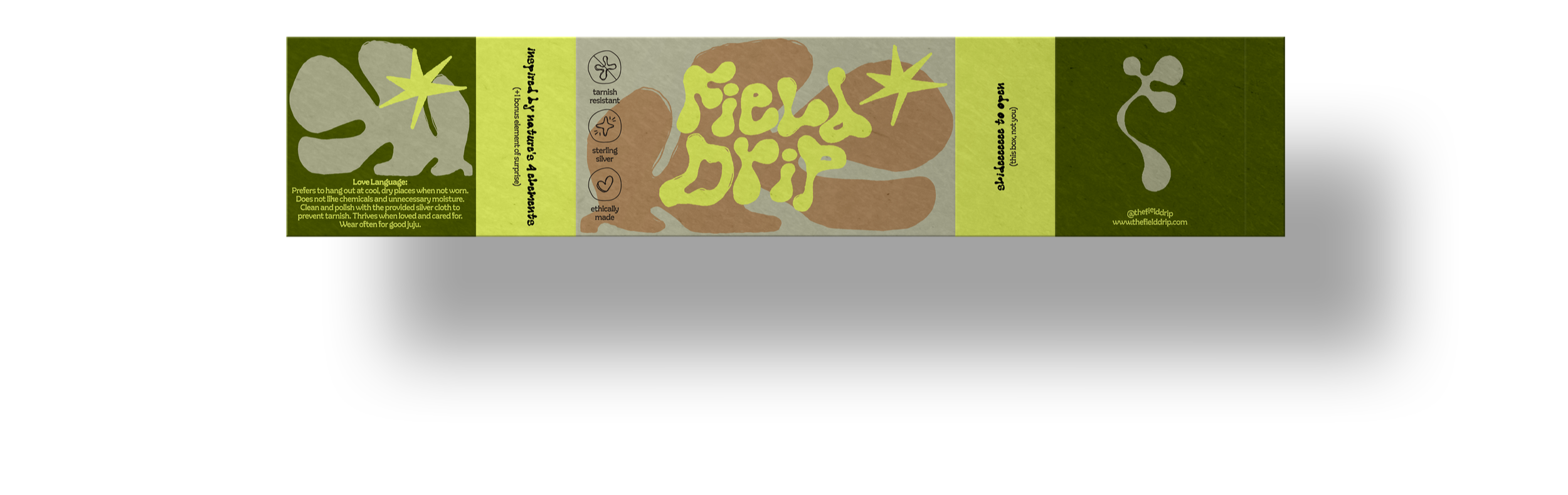
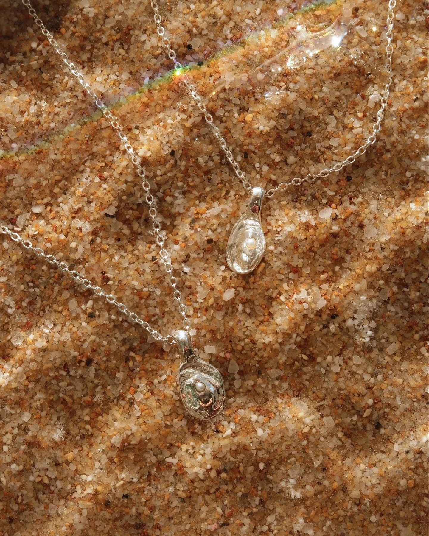
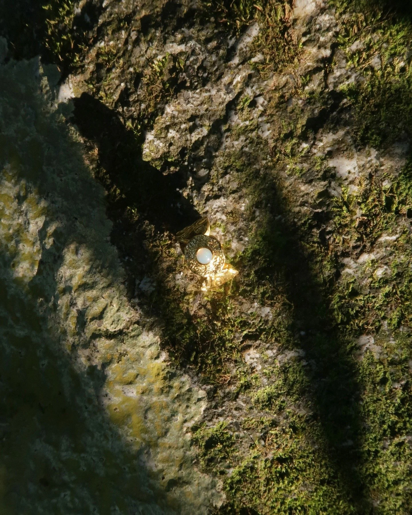
Field Drip
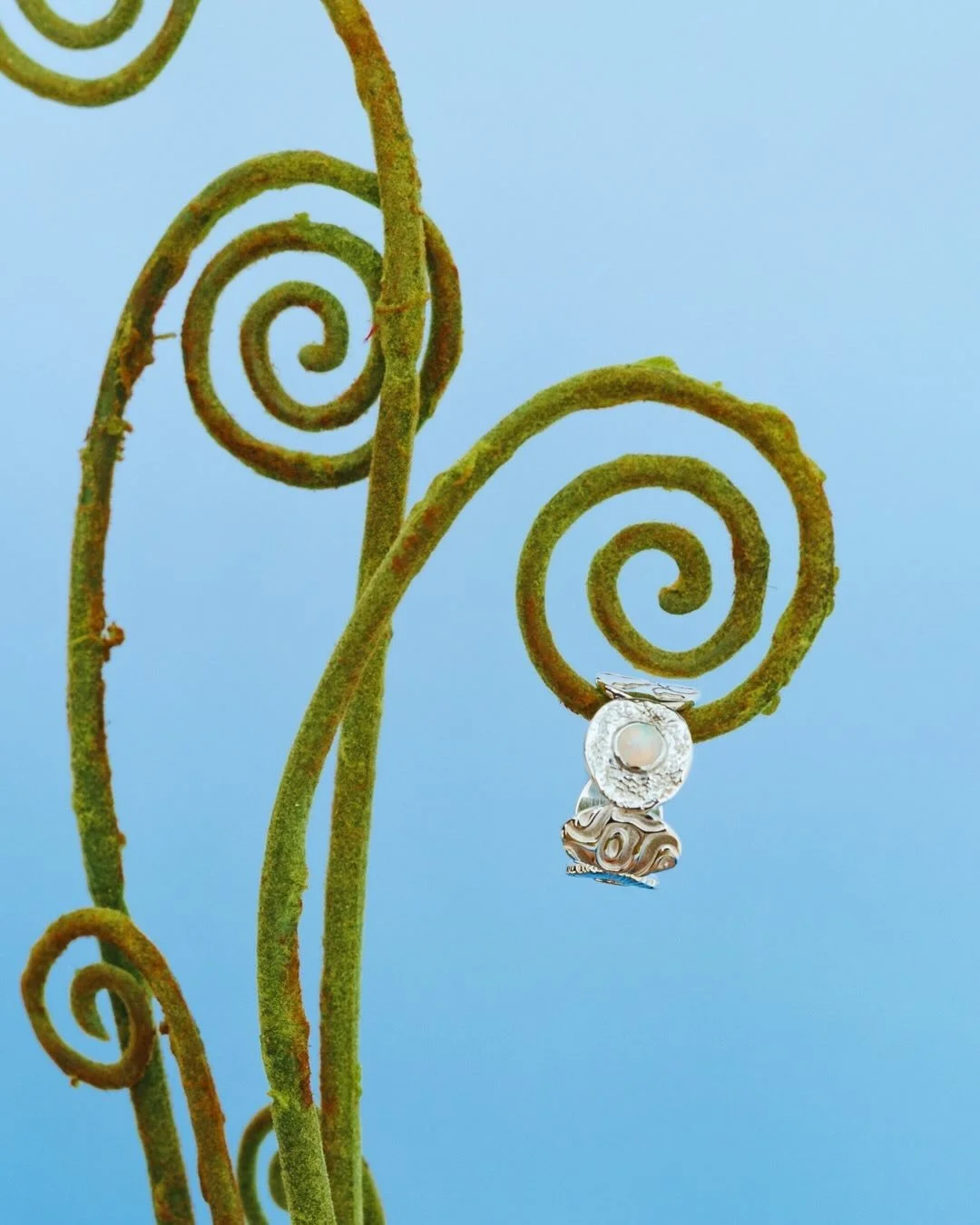
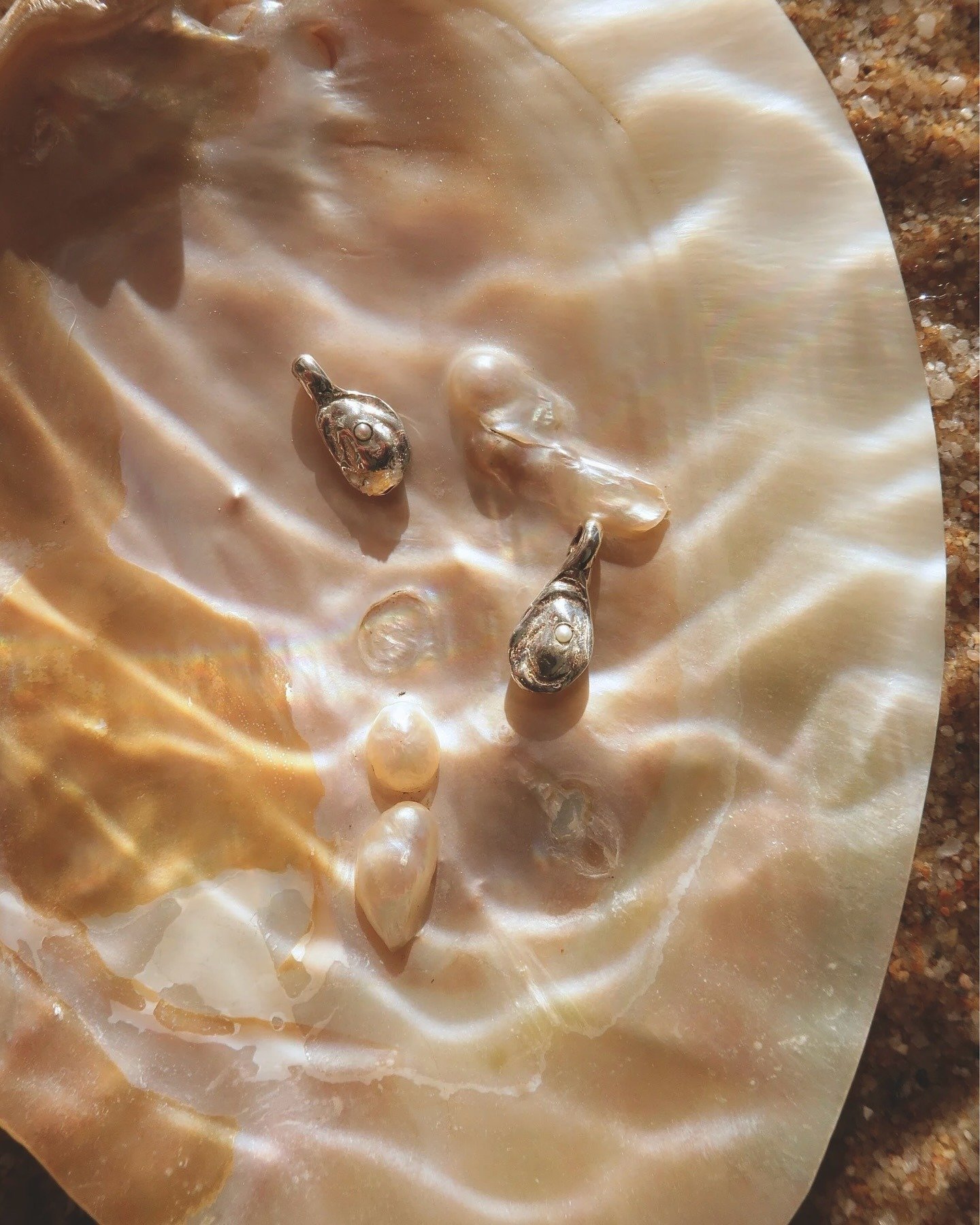
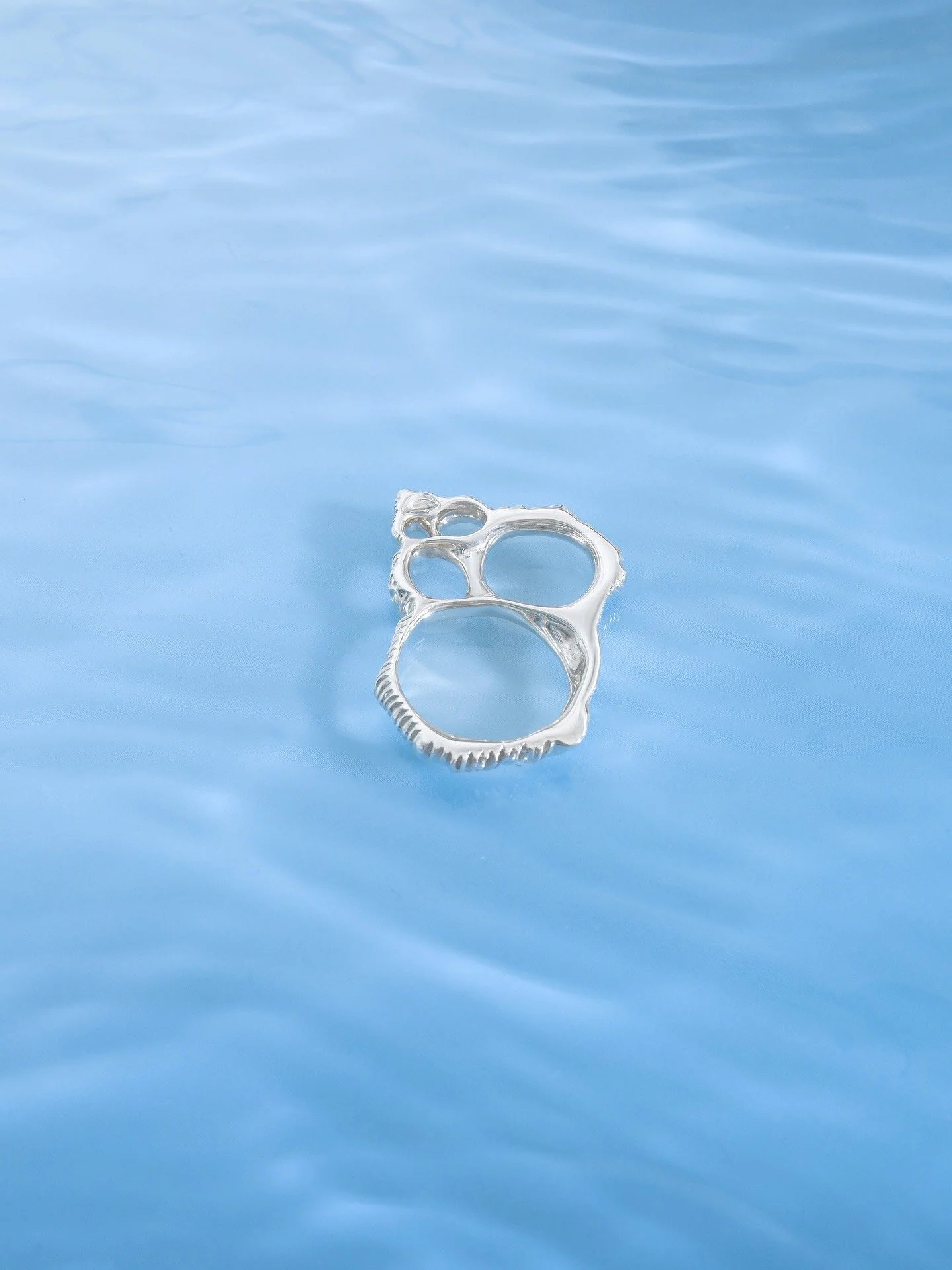
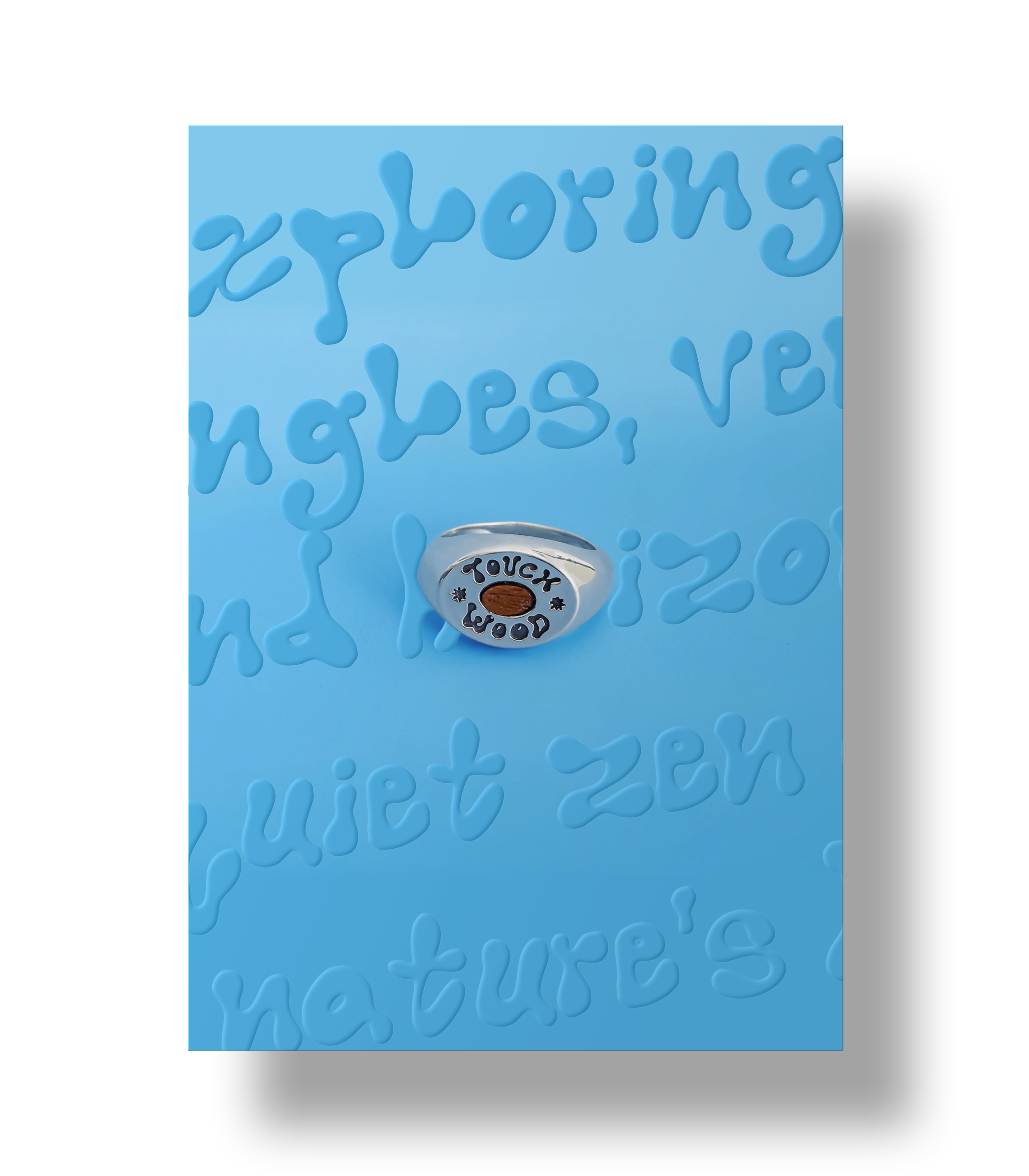
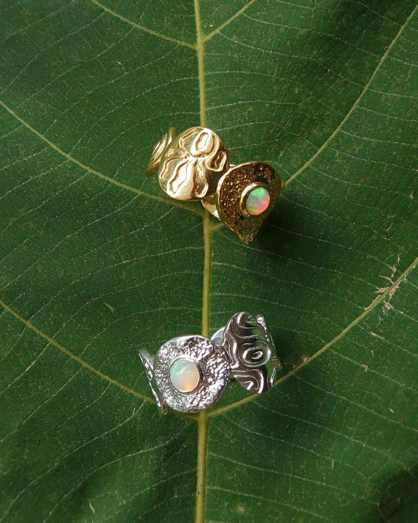
Field Drip is a tribute to the journey; a translation of experience into moulded precious metals guided by natural rhythms. Inspired by open spaces and the personal adventures of Nicole Cara, the brand embodies perpetual motion; much like nature itself, everything is constantly evolving, and so is the jewellery.
Rather than positioning the pieces as luxurious, Nicole Cara intended them to feel personal and special. When she came to us, she wanted the identity to feel earthy and grounded while reflecting the fluidity of change.
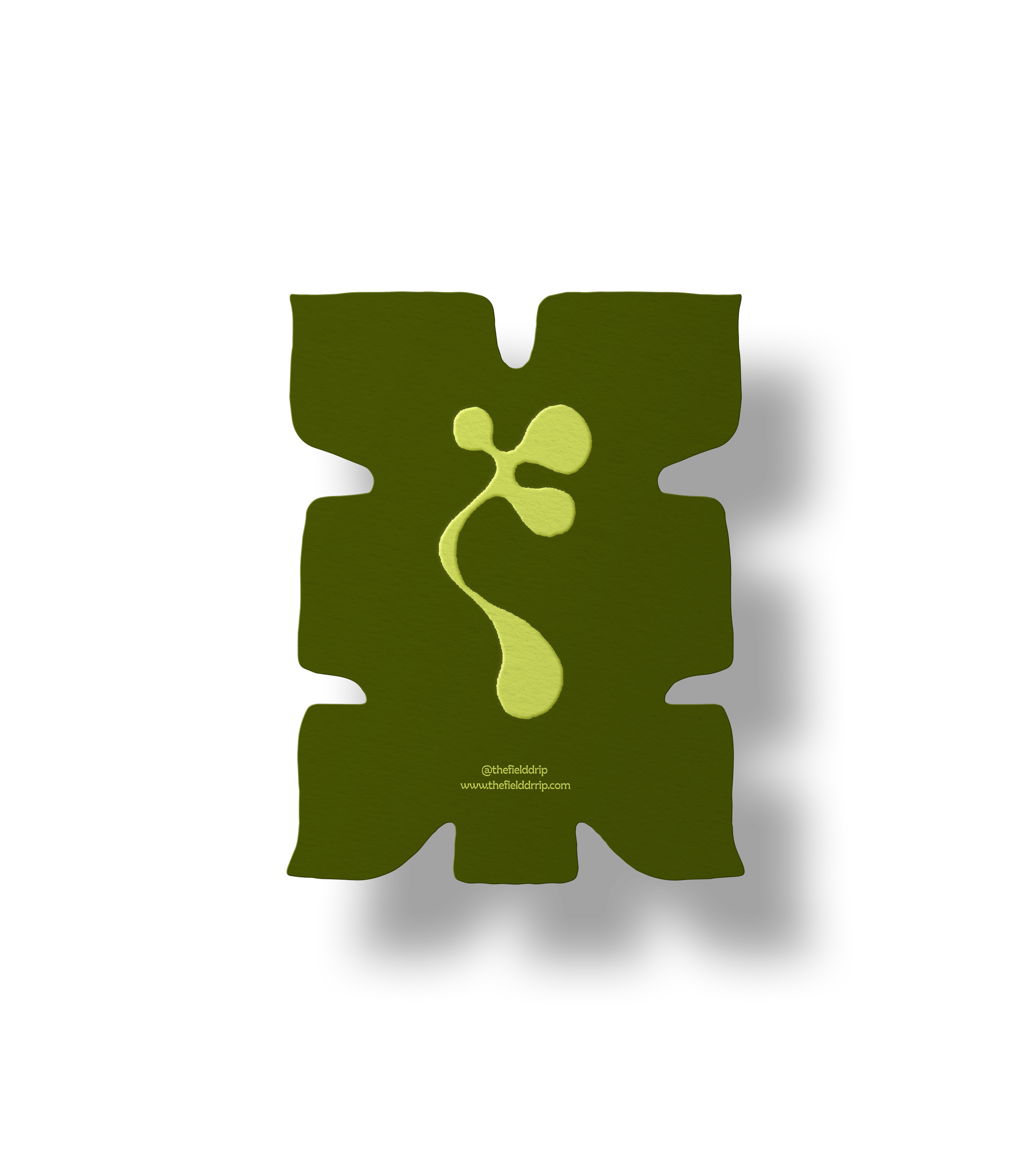
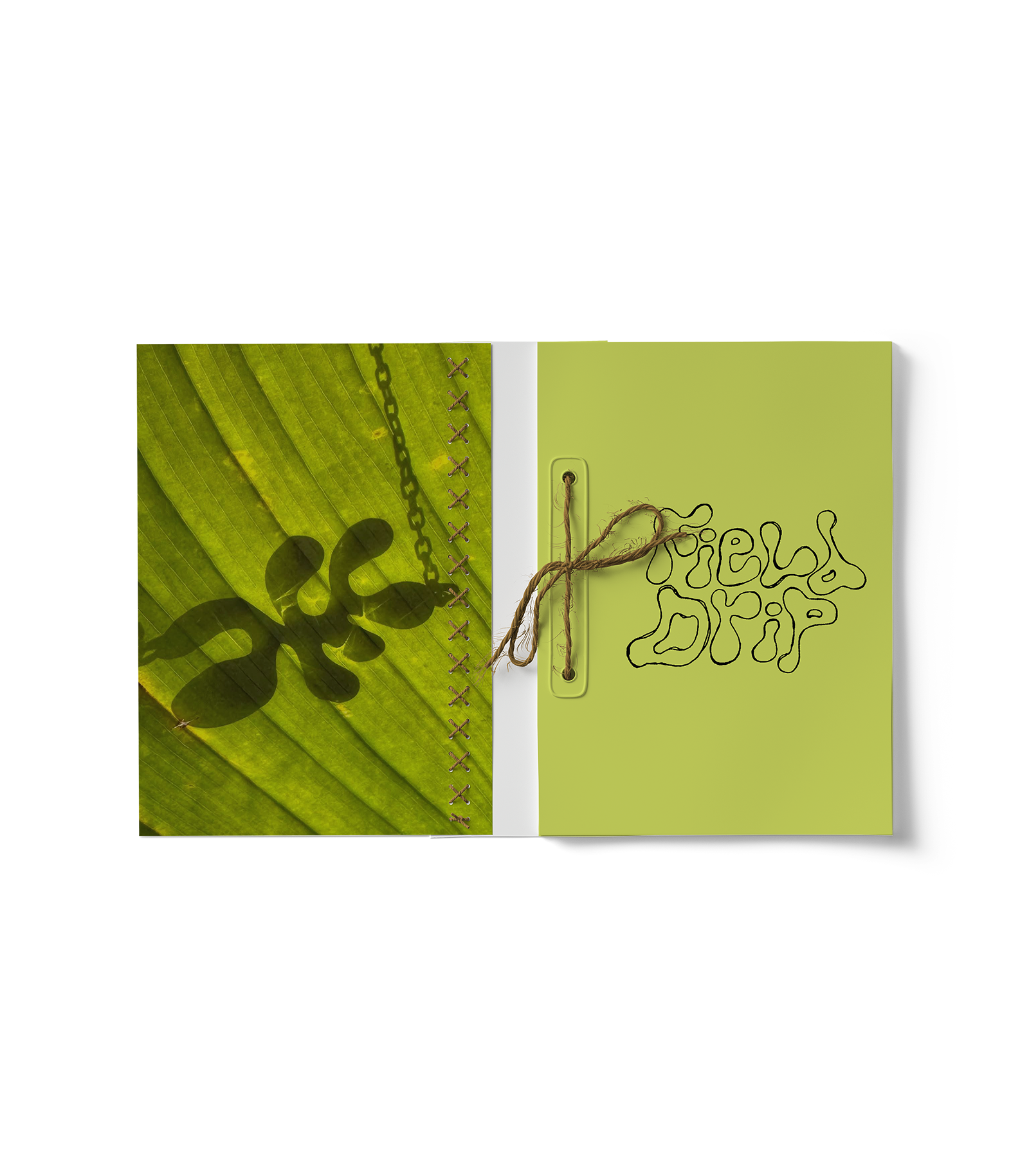
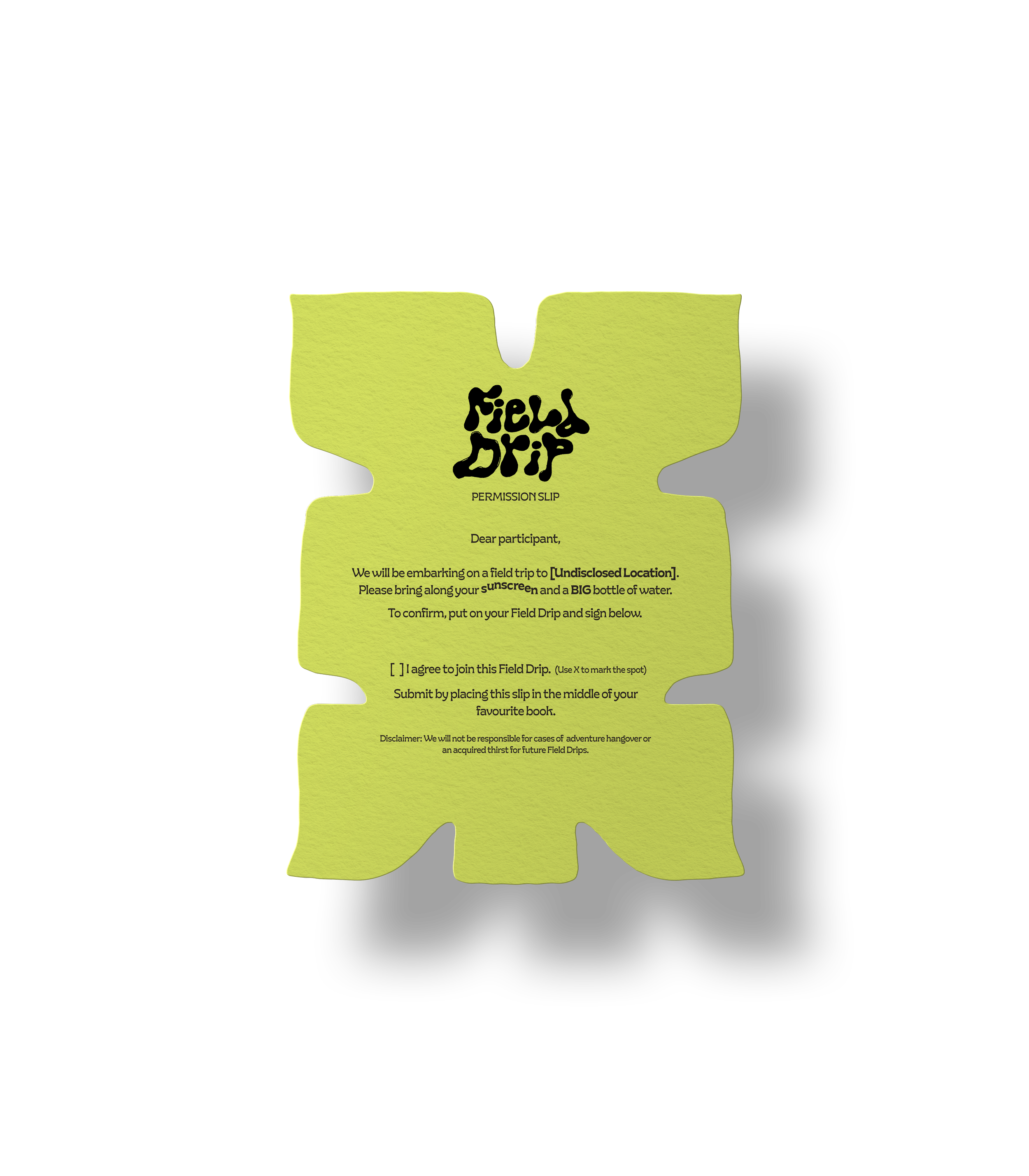
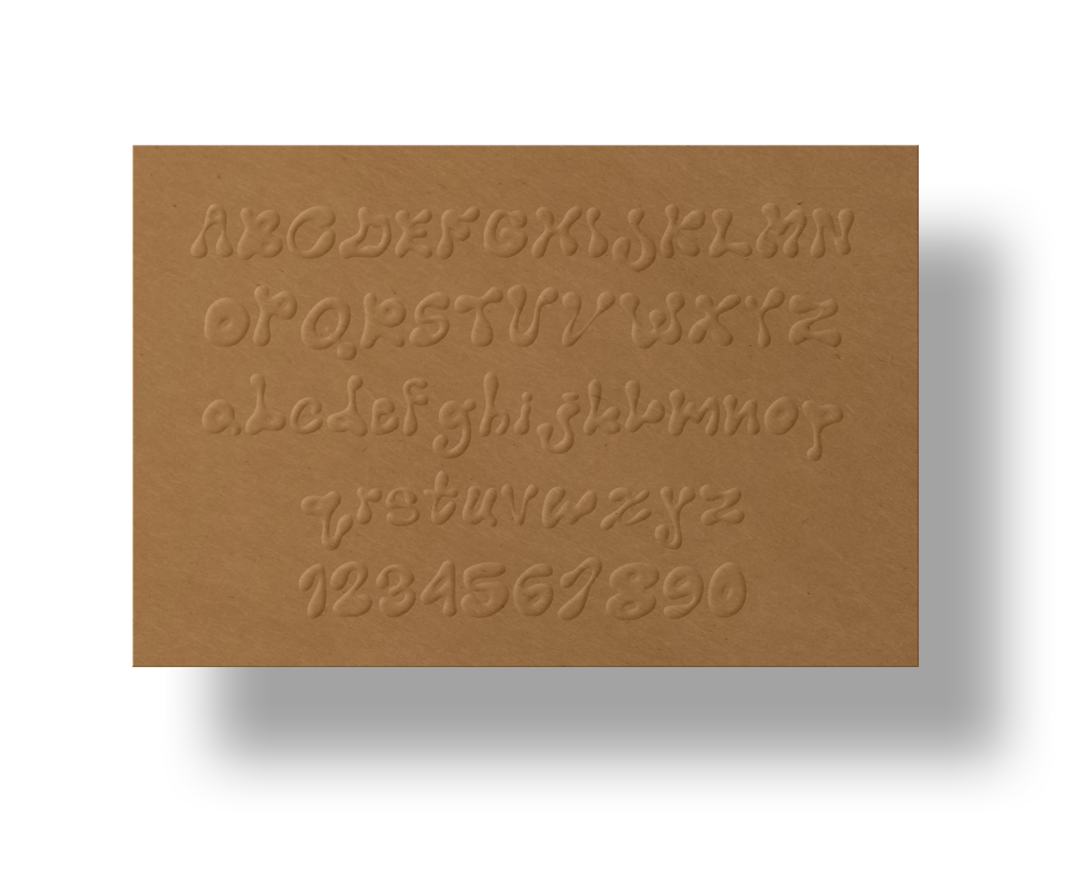
To create the logo, we drew inspiration from natural elements and drip-like formations, taking the words “Field” and “Drip” quite literally. We loosened our wrists and created the Field Drip typography using pen on paper before digitising it; a process that became the foundation and visual language carried throughout the entire project.
Images courtesy of Field Drip
Scope: Logo, Branding, Font Design
Client: Field Drip
Completed: January 2025