Granule
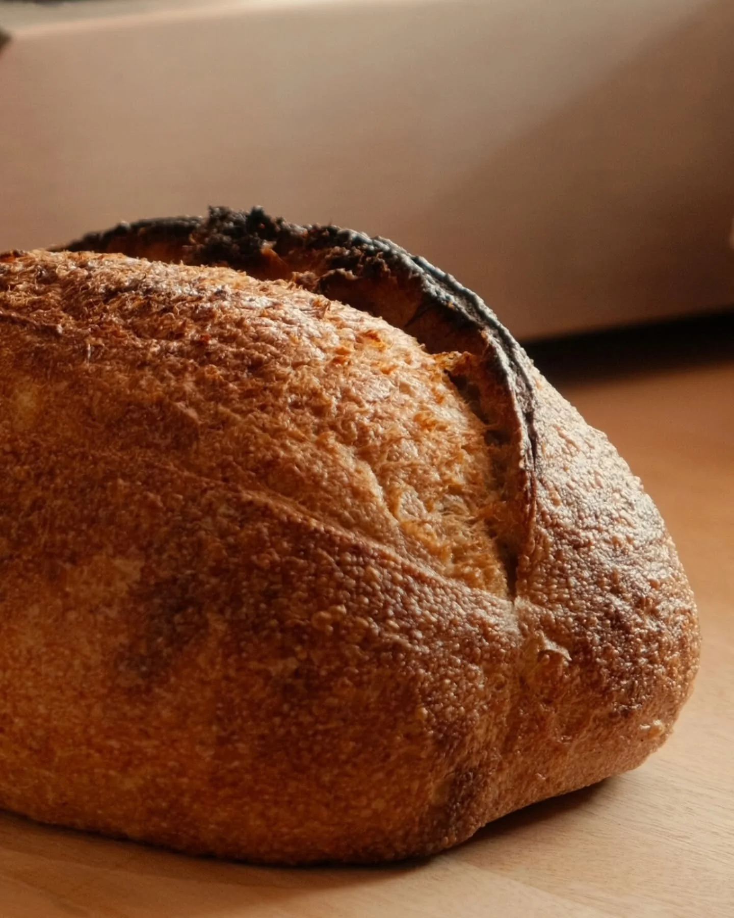
When Malcolm first approached Crayon, he gave us complete creative freedom. Our starting points were photos of his baked goods and the name “Granule,” a word that suggests the smallest unit of a whole—subtle, foundational, and alive.
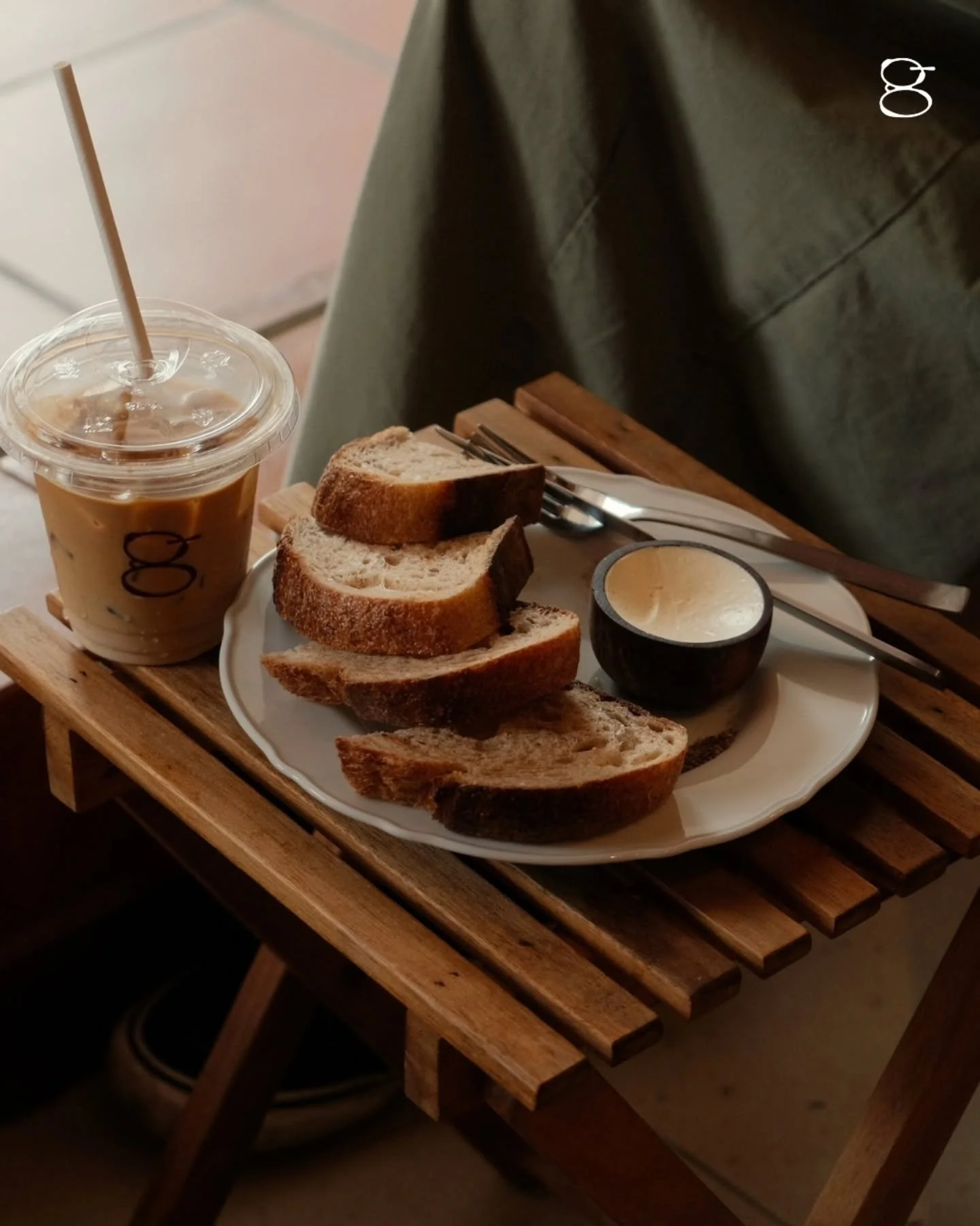
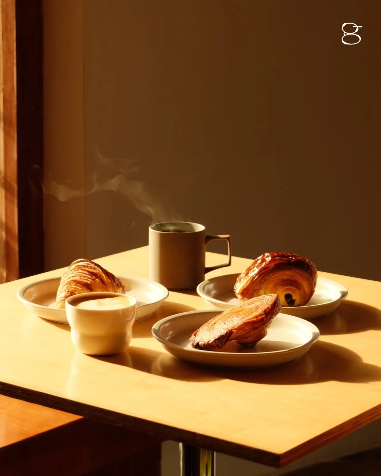
We recognized early that Granule was more than a bakery: it’s also a coffee space and, crucially, a neighbourhood hub. The brand needed to unite these three elements cohesively and intentionally.
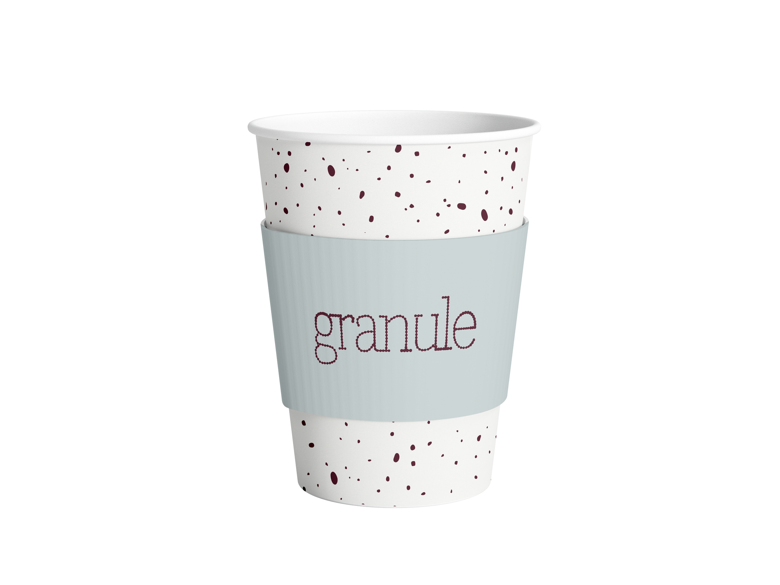
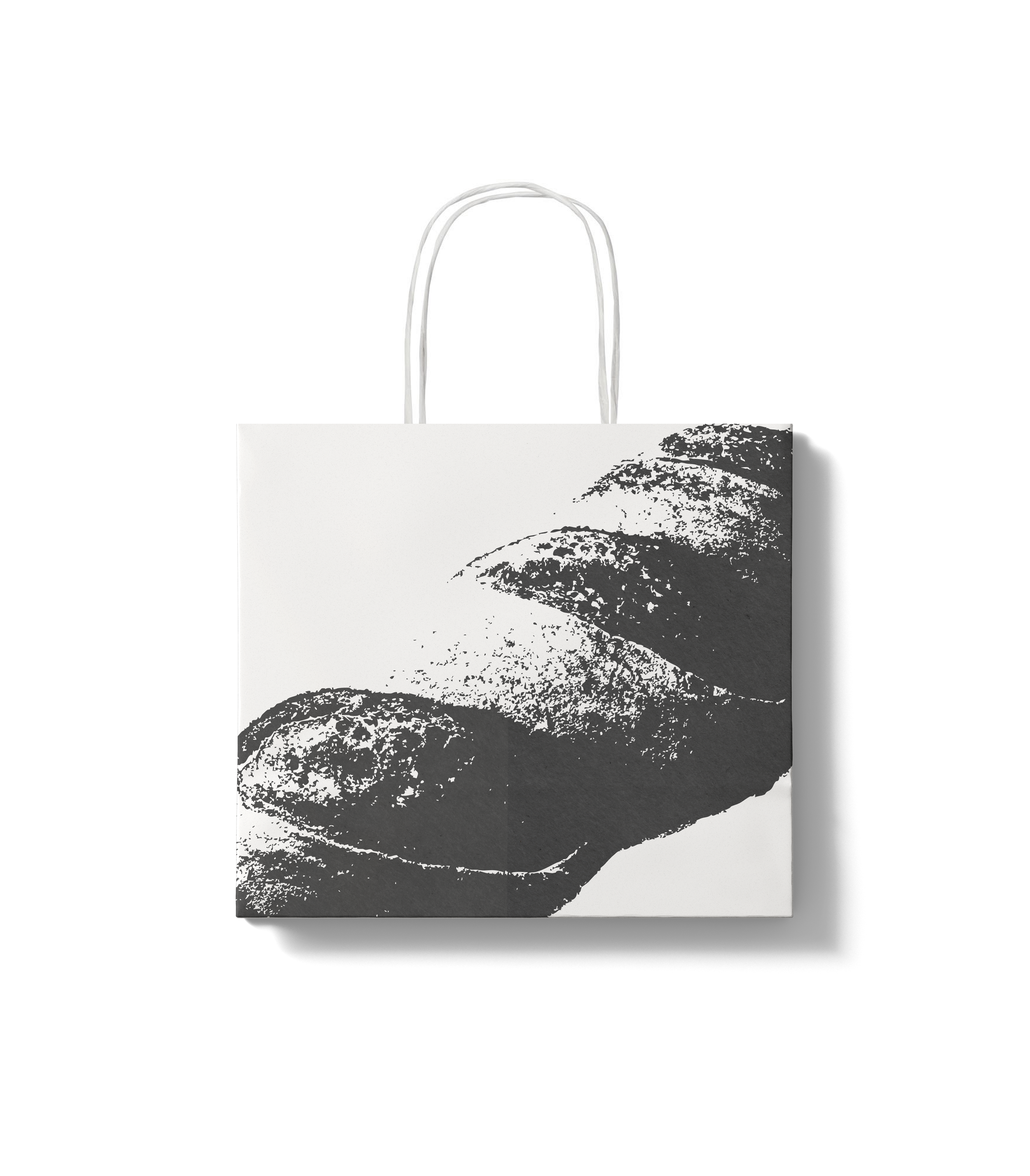
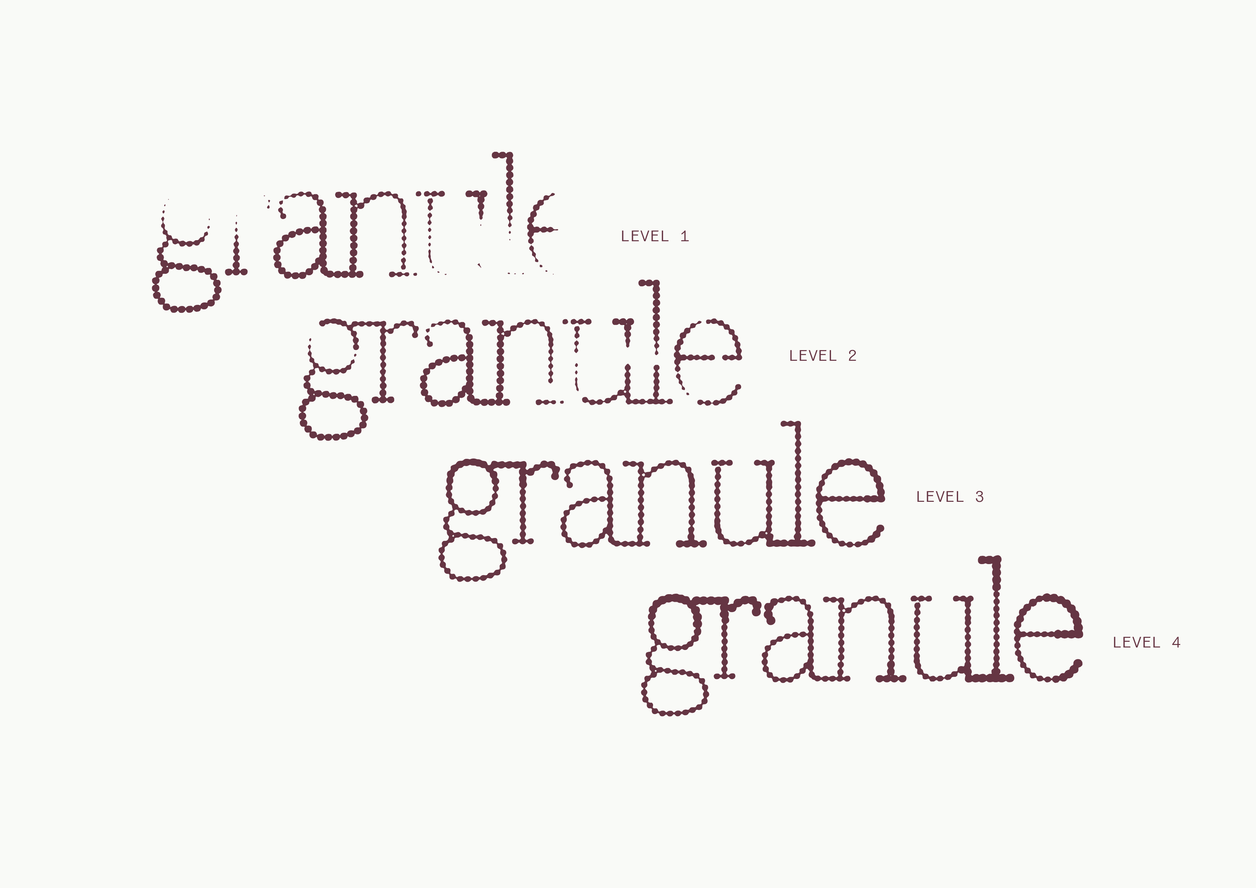
We developed a logotype made of tiny granules. Up close, the forms read as abstract dots; from a distance, they resolve into the word “Granule.” The concept of micro forming macro became the identity’s foundation: small parts building something larger, like the community it serves.
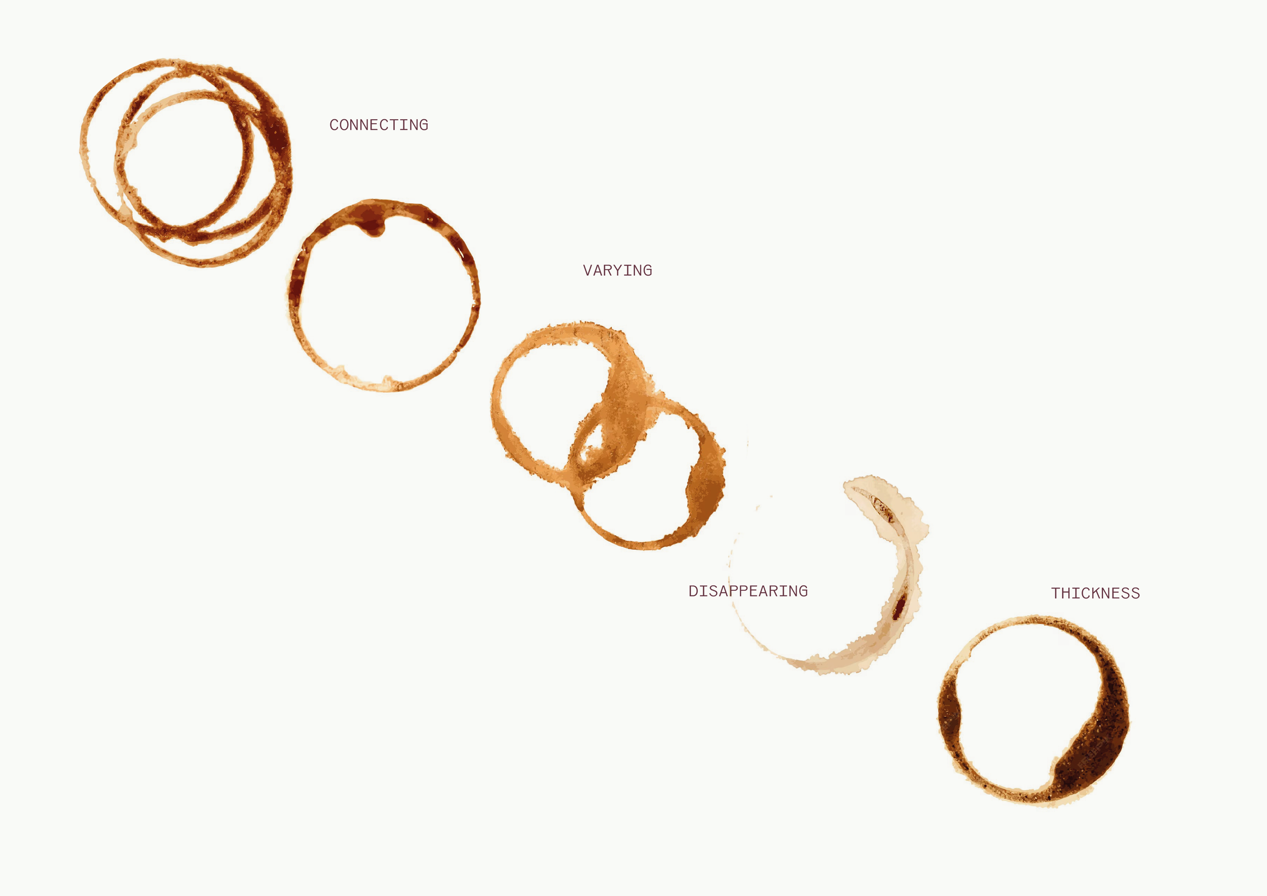
The visual language includes illustrations based on the cross-section of bread, referencing the gluten matrix alongside textures sampled from Malcolm’s bakes and the tactile qualities of coffee. Together, these elements create a quietly dynamic system that allows the brand to grow while remaining rooted in its smallest details.
For the visual look and feel: we kept it clean and reflective of Malcolm. Considered, precise, and grounded in craft. Their collaboration with Monét coffee, brings in an experimental, slightly rebellious energy. The brand guide supports two directions: pristine yet offbeat—pushing the same core elements into a grungier edge.
Scope: Brand Identity
Client: Granule
Completed: December 2025