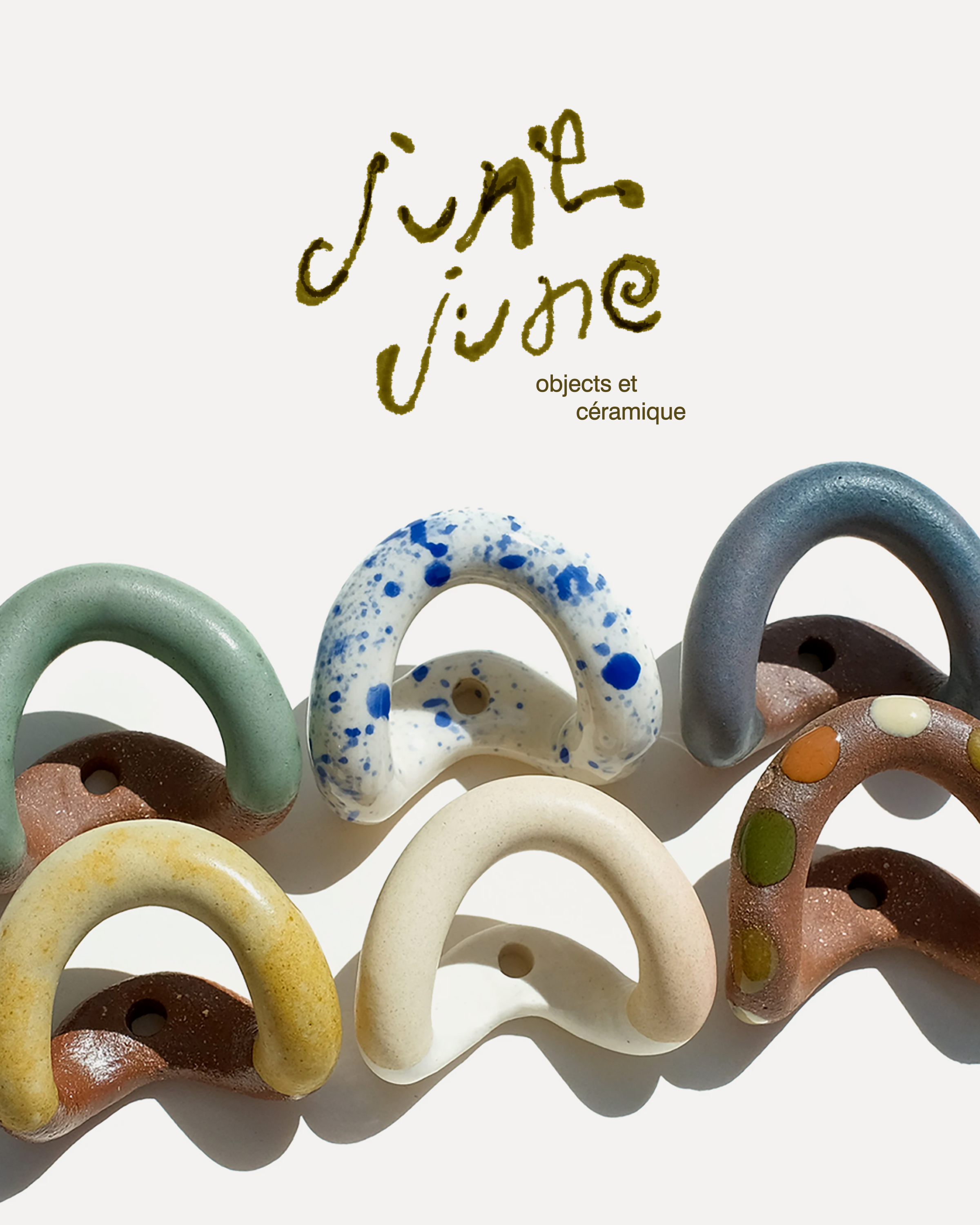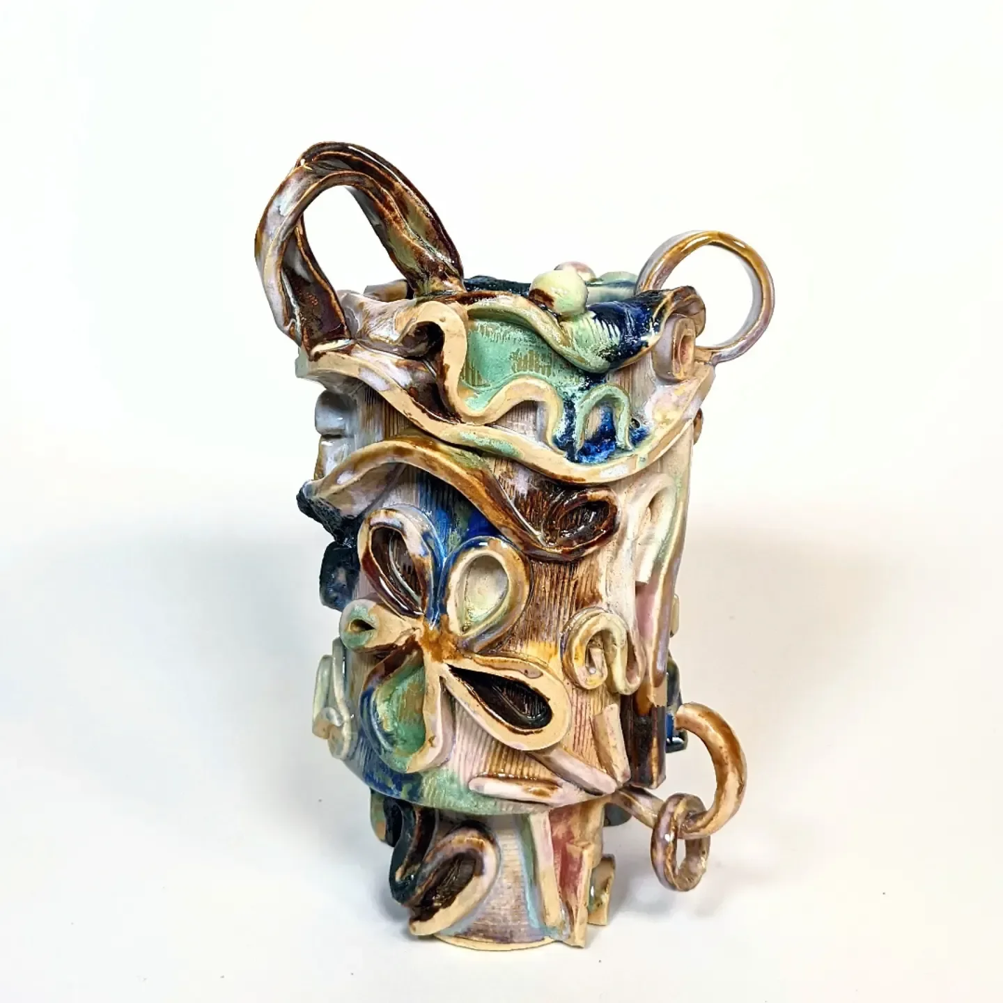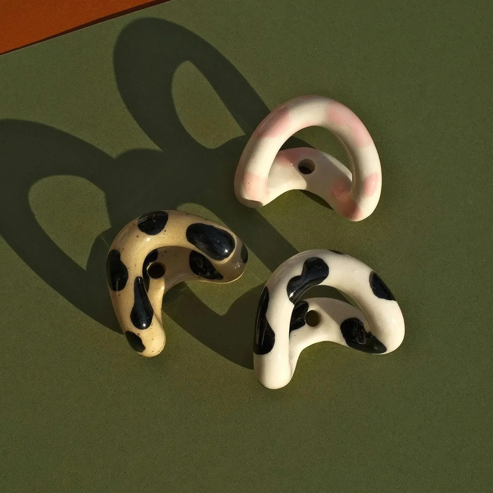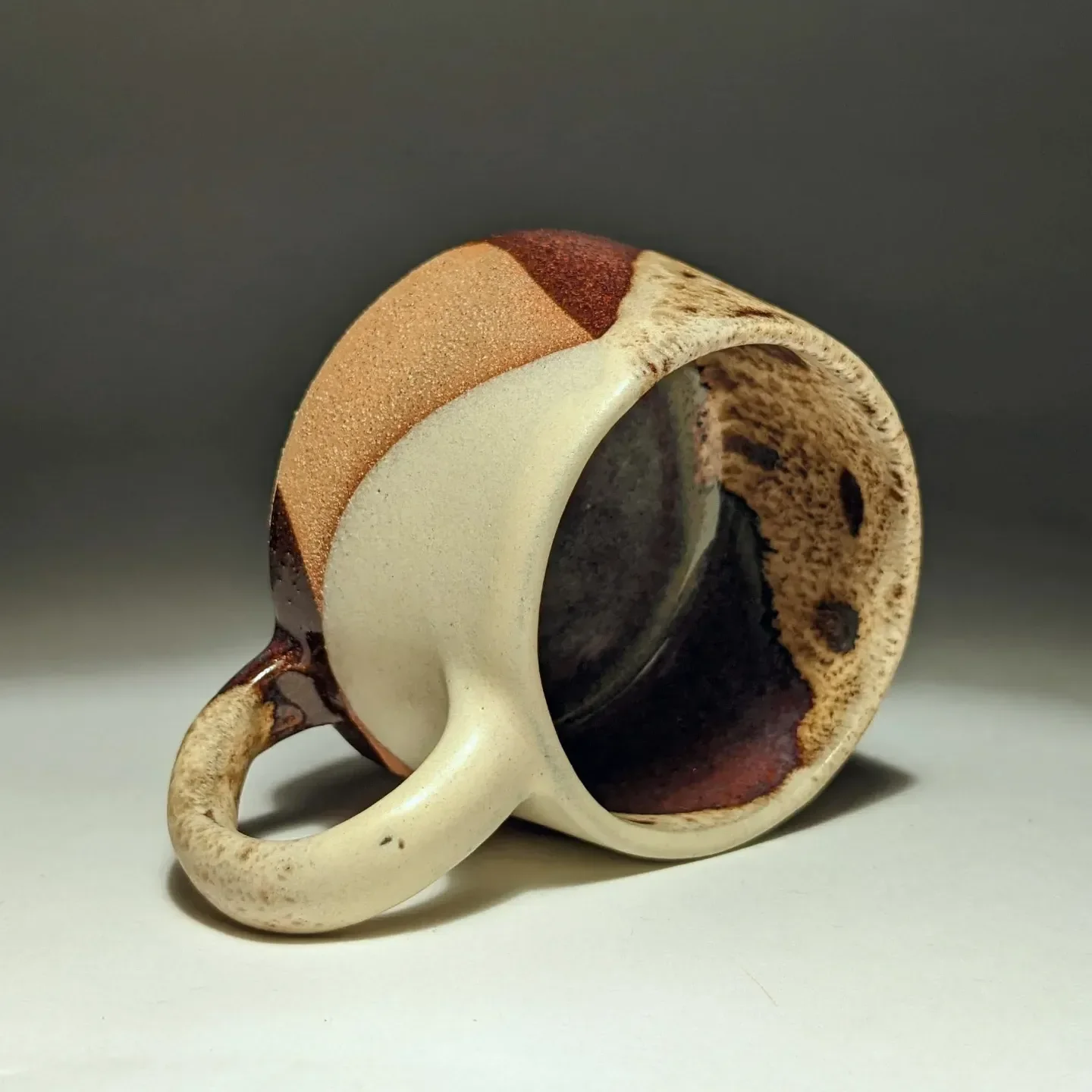
Studio Junejune is a ceramic studio based in Montreal. When Jo first came to us with her idea, she had a very clear vision. Formerly known as Junechild Ceramics, her personal brand and artistic style have evolved over the past two years, and the previous identity no longer fits. She wants to move forward as Junejune and leave the old identity behind.
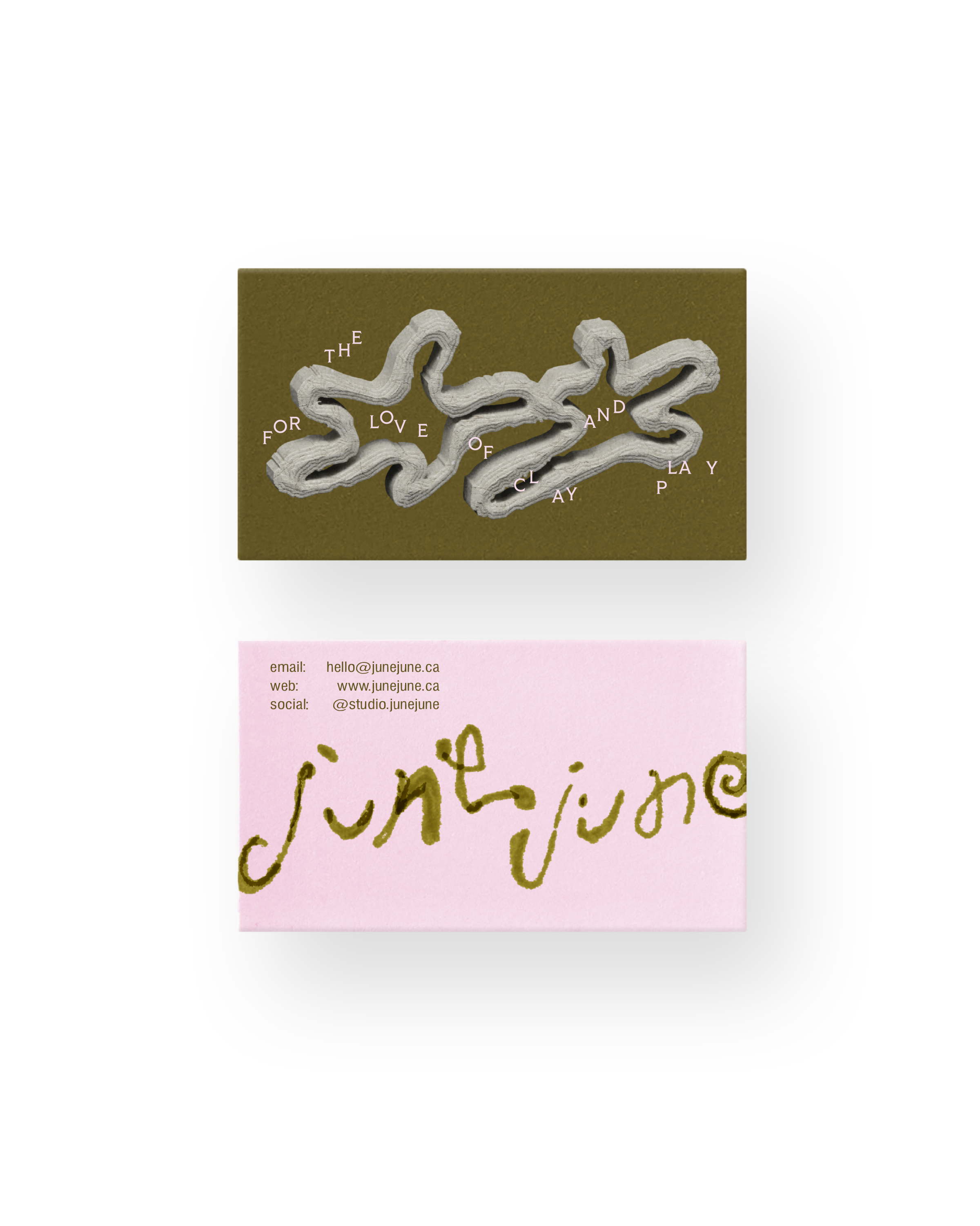
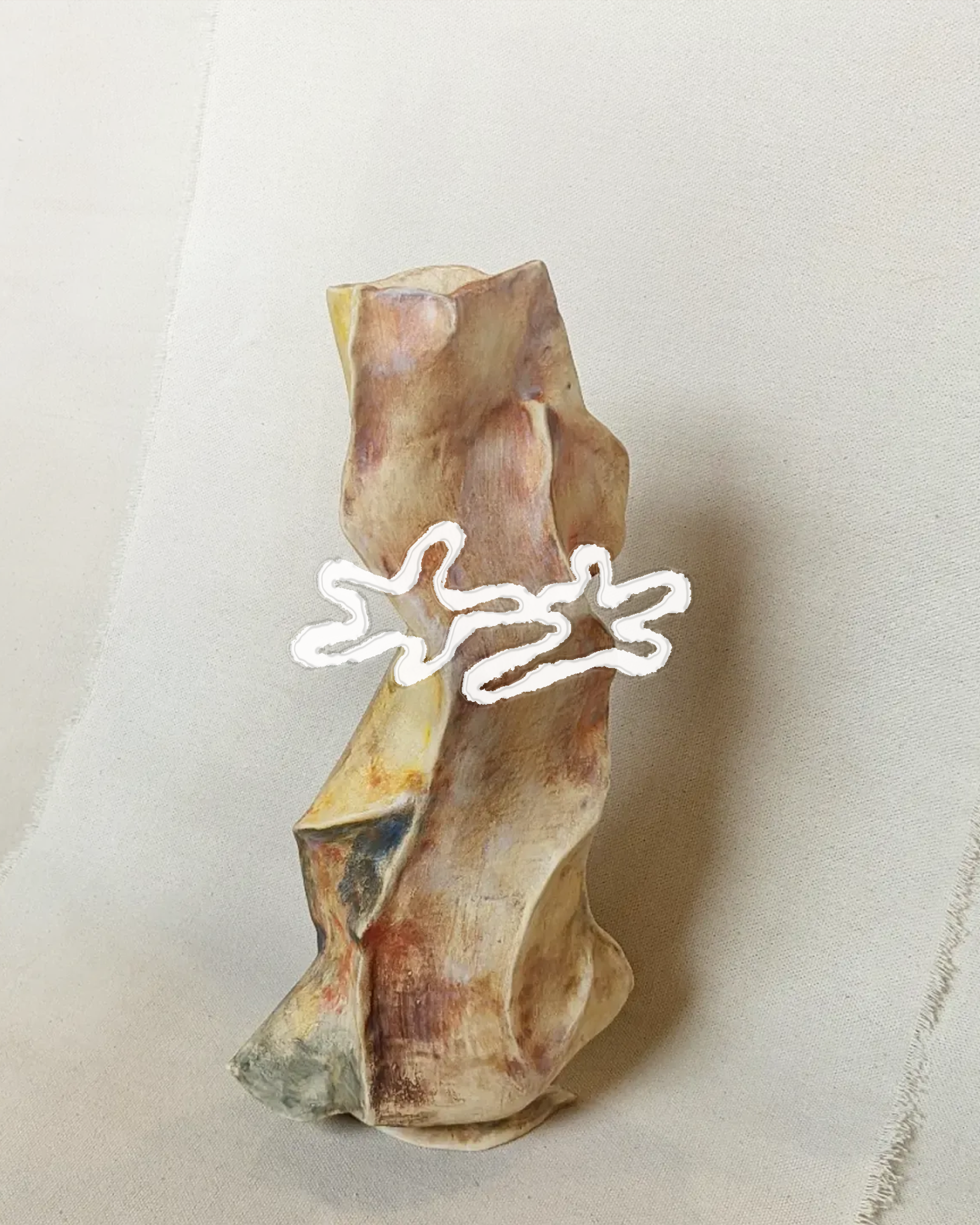
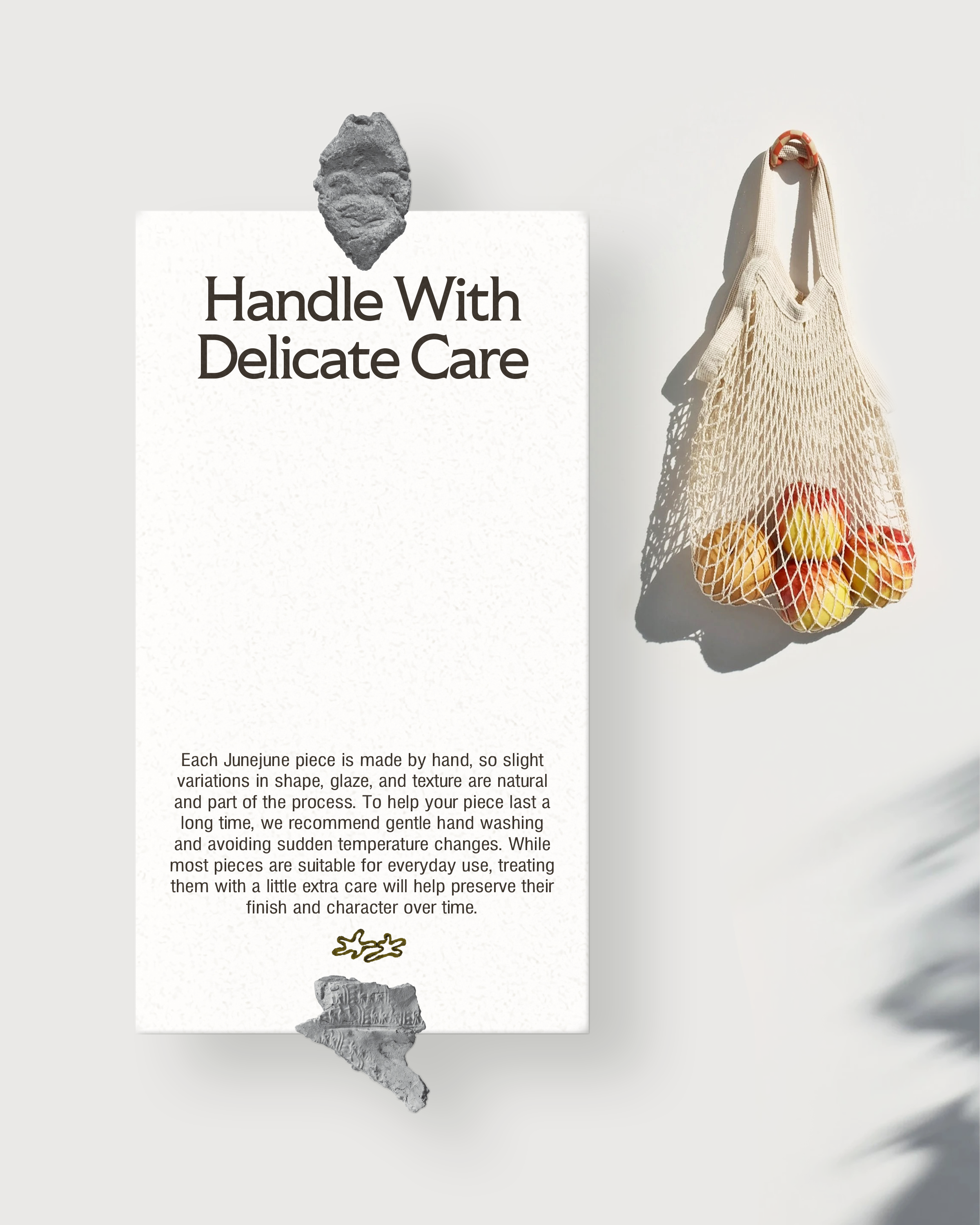
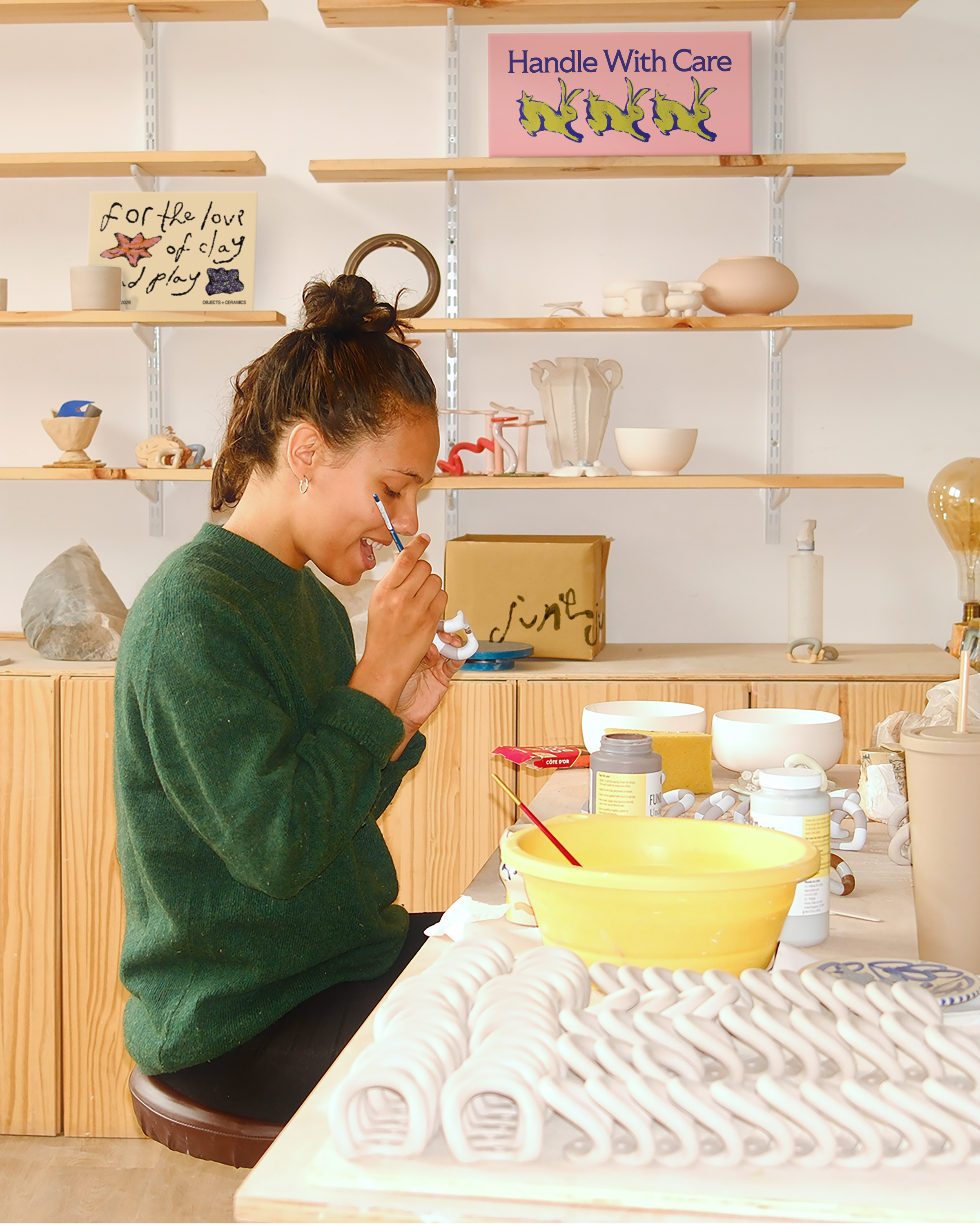
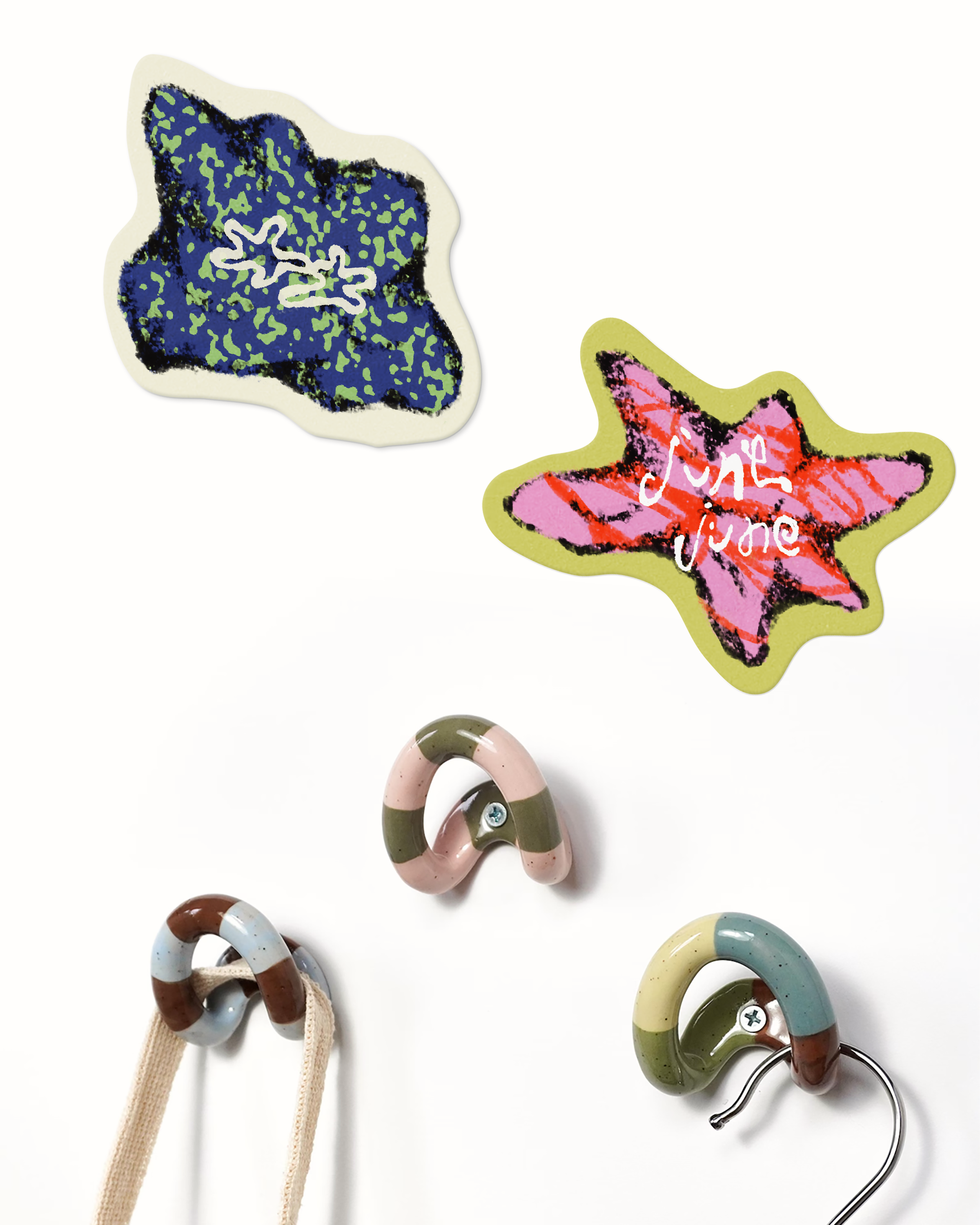
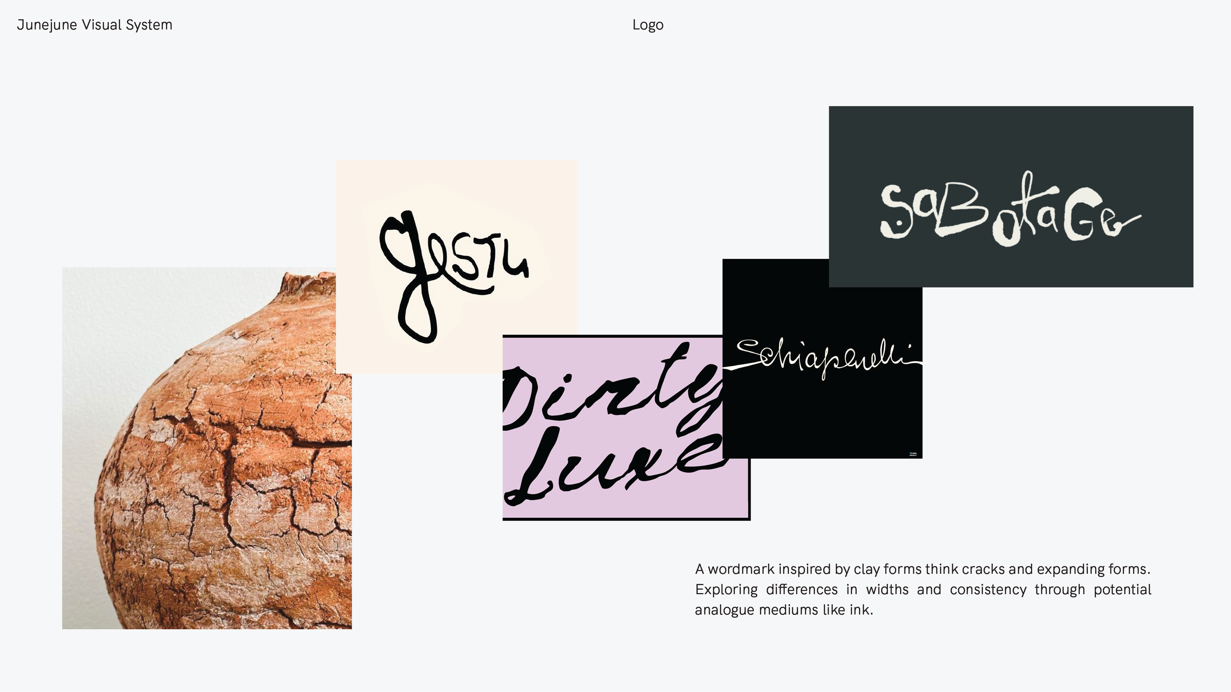
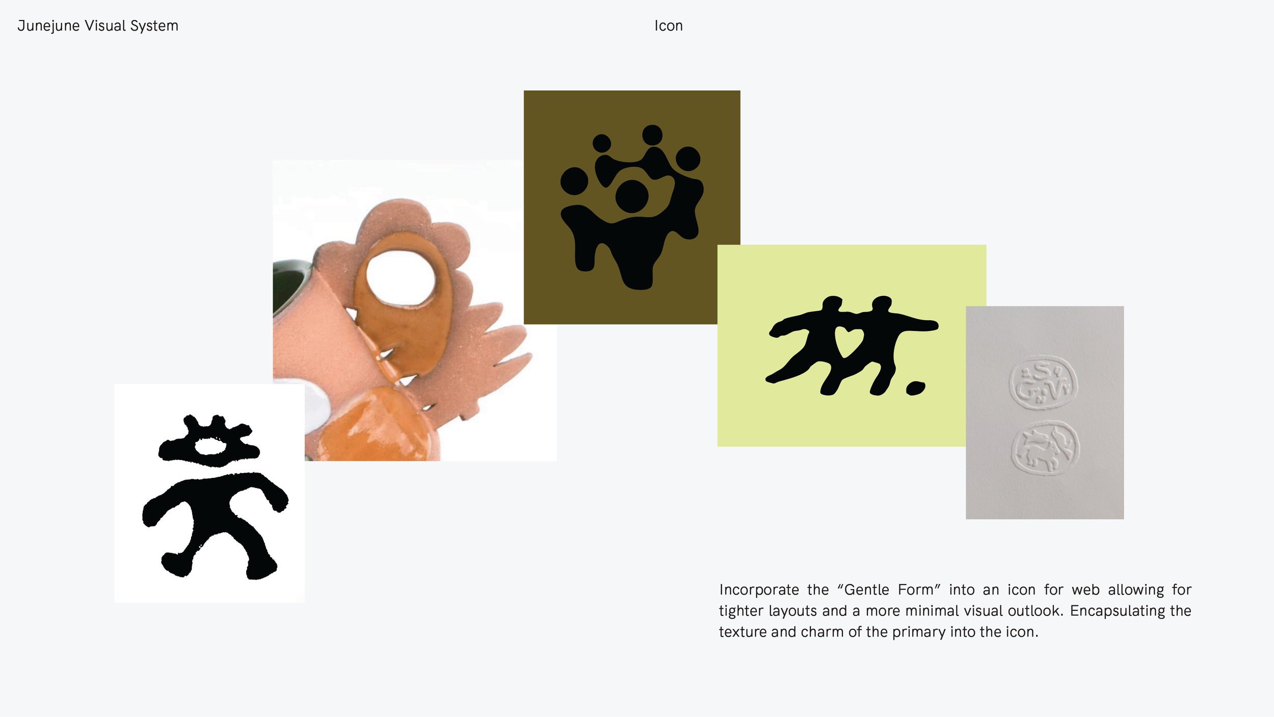
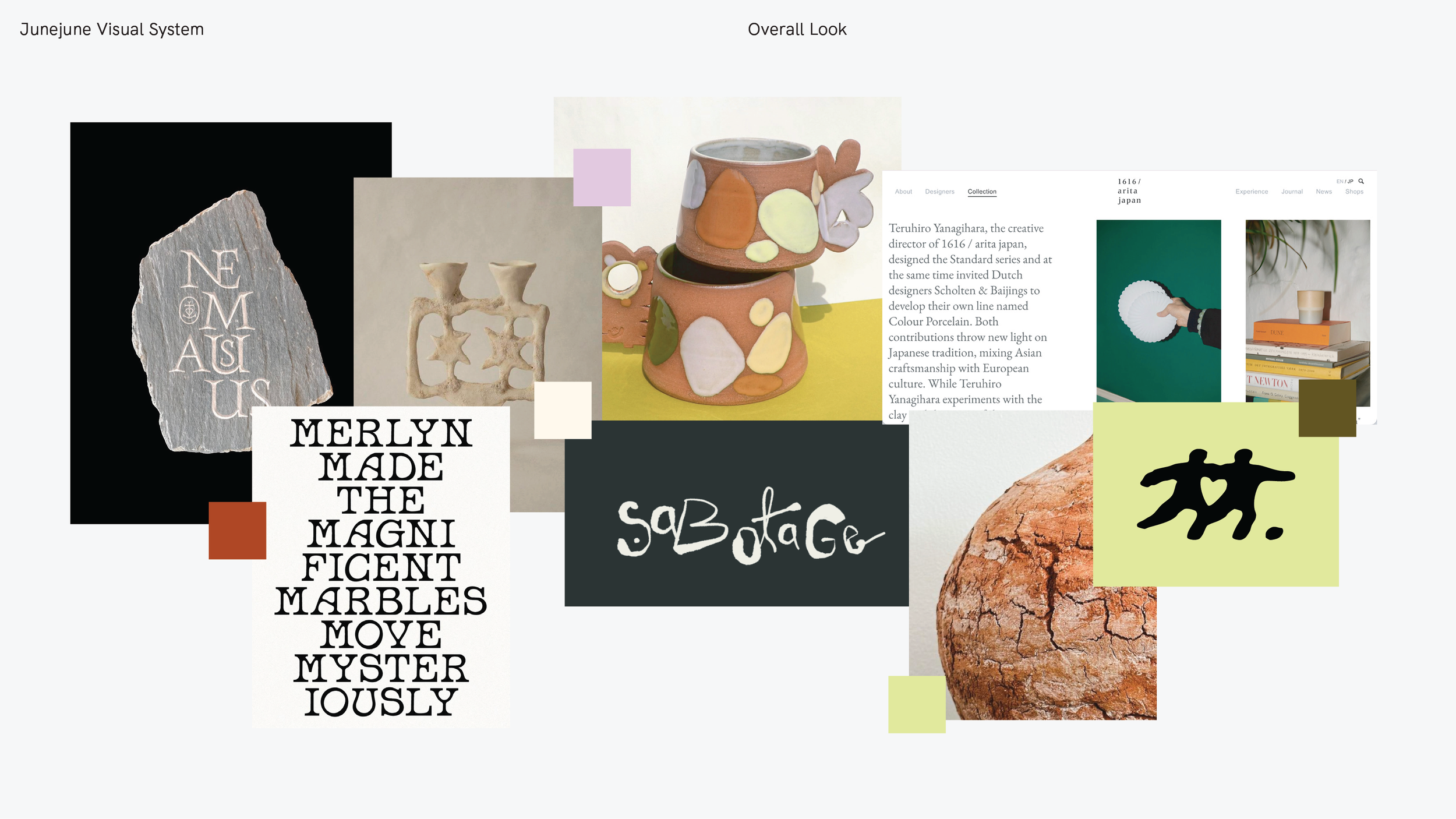
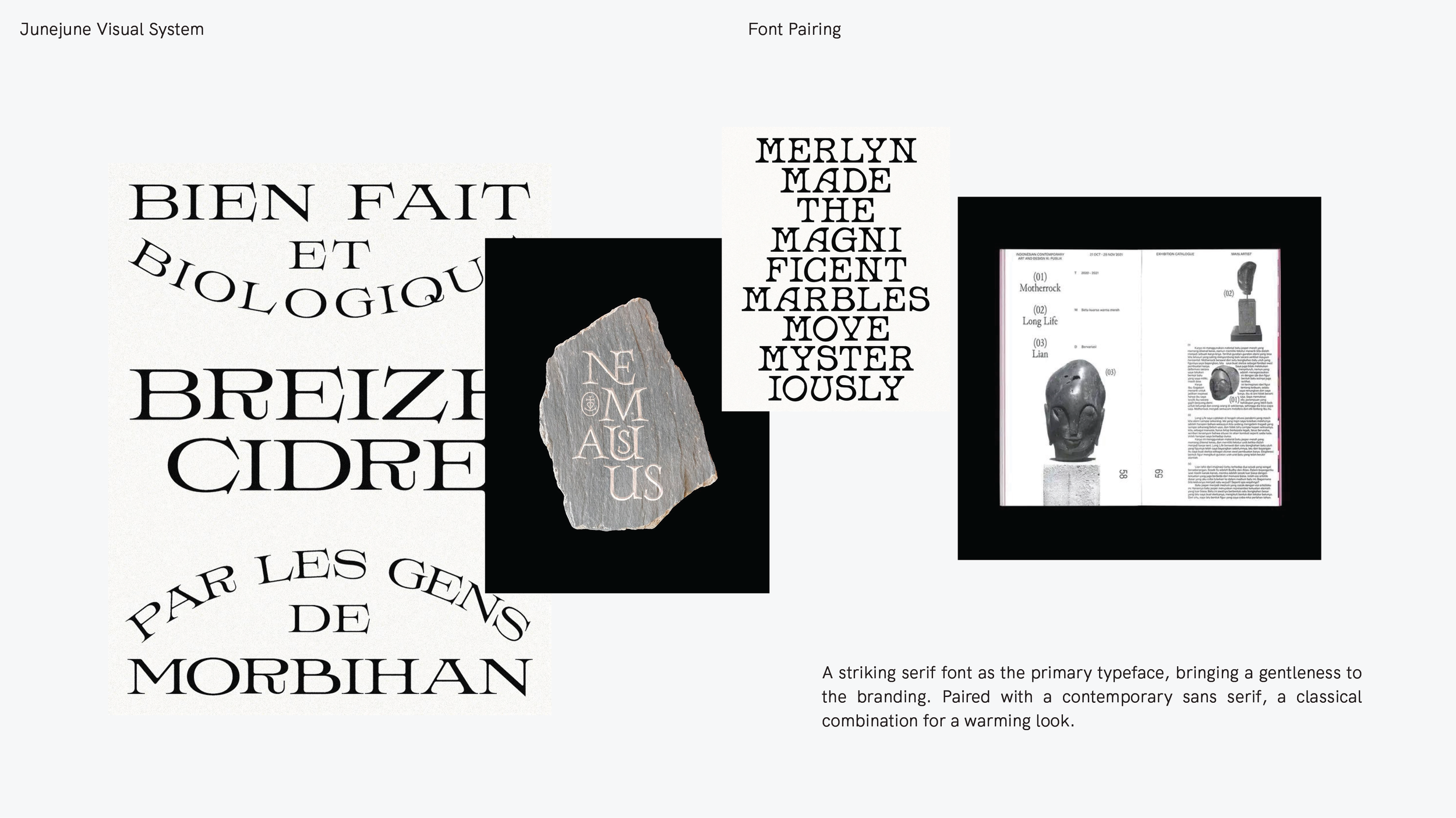
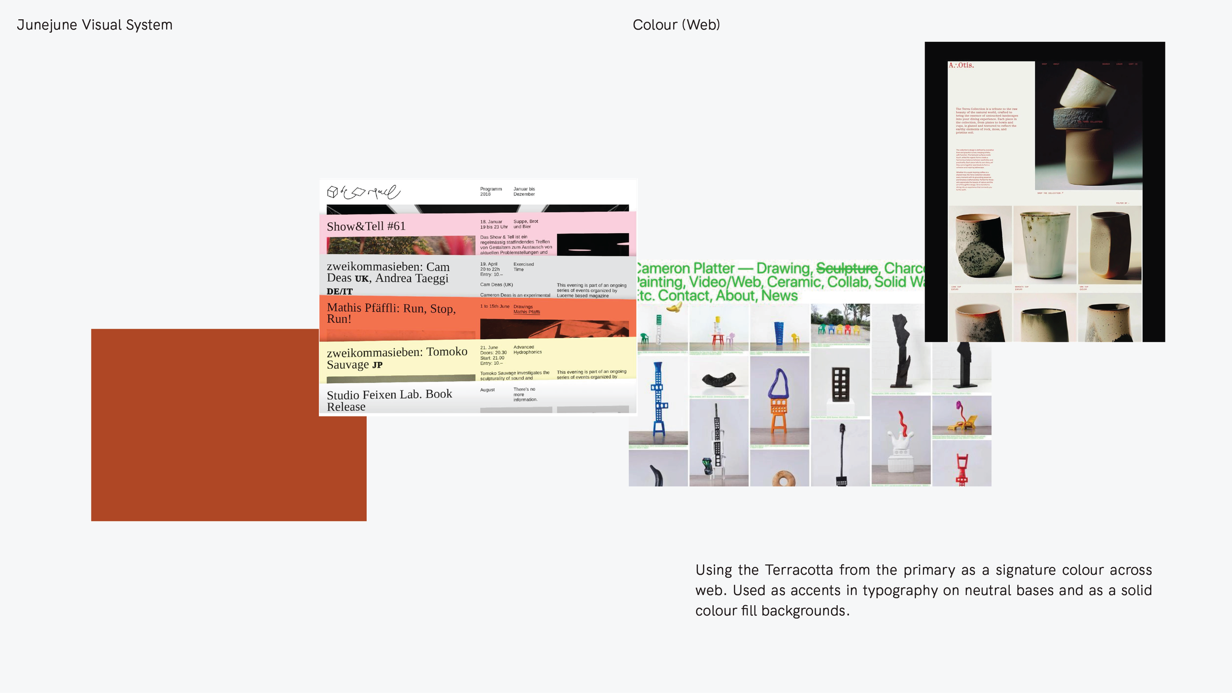
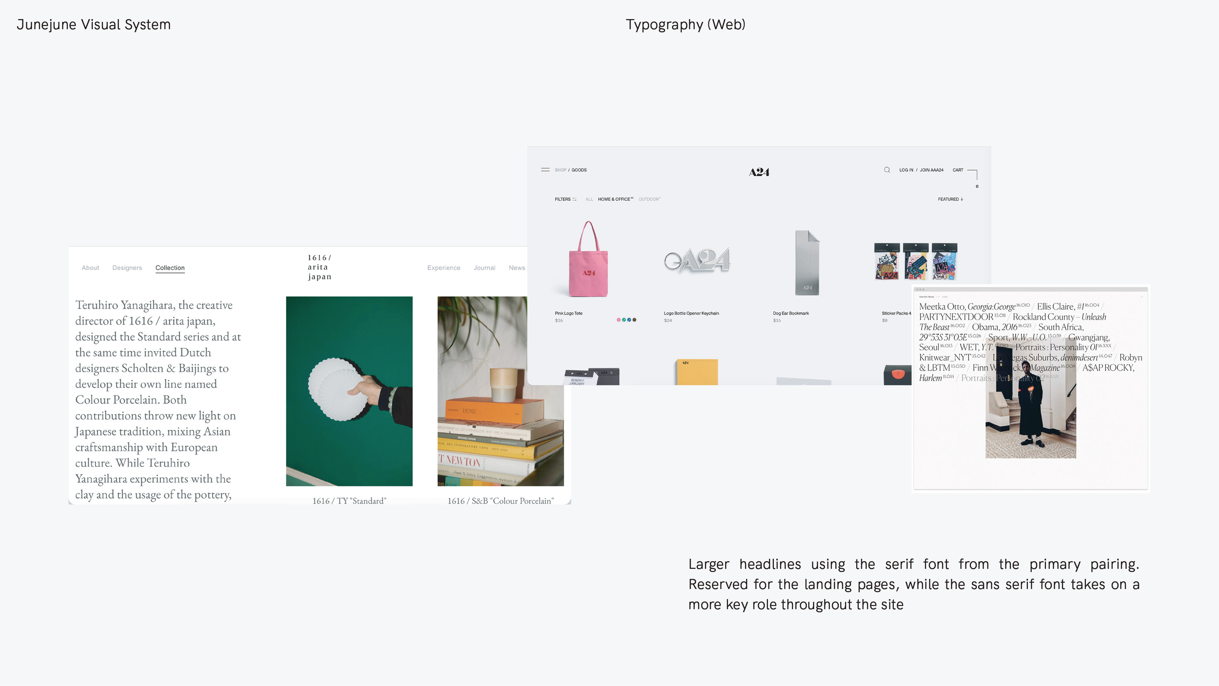
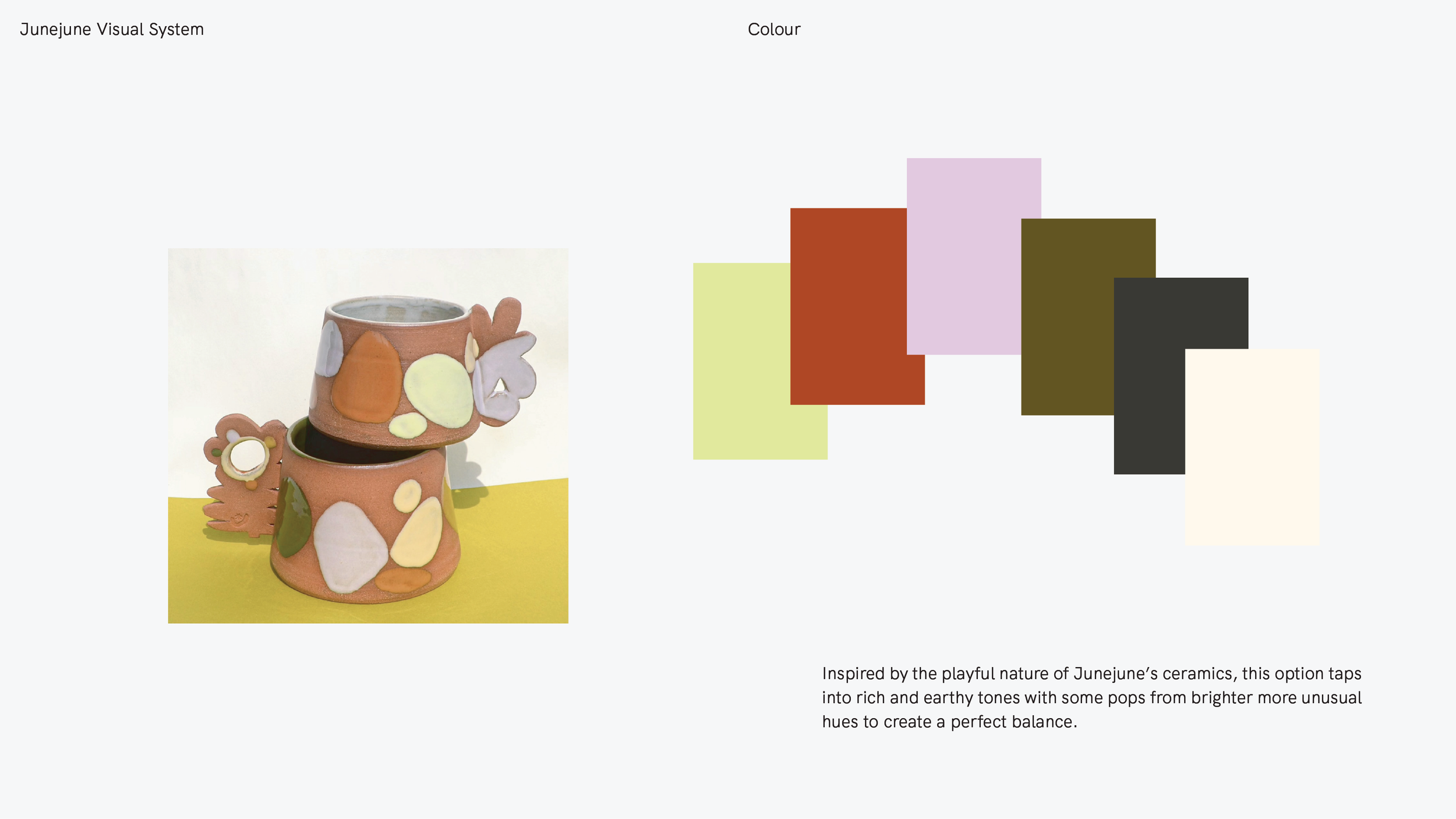
We pitched a couple of concepts and unanimously decided on A Gentle Form, inspired by the process of making ceramics. The typography logo takes inspiration from cracks, glaze, and the natural texture of clay. The double-star icon reflects the playful repetition of Junejune. A bold display type is paired with a simple sans serif for balance. The colours come from Junejune’s ceramics, mixing earthy clay tones with bright pops of colour. We baked an identity that feels more earthy, slightly elevated, but still has a sense of play. A little folky and offbeat.
Images courtesy of Studio Junejune
Scope: Logo, Branding, Collateral
Client: Studio Junejune
Completed: July 2026