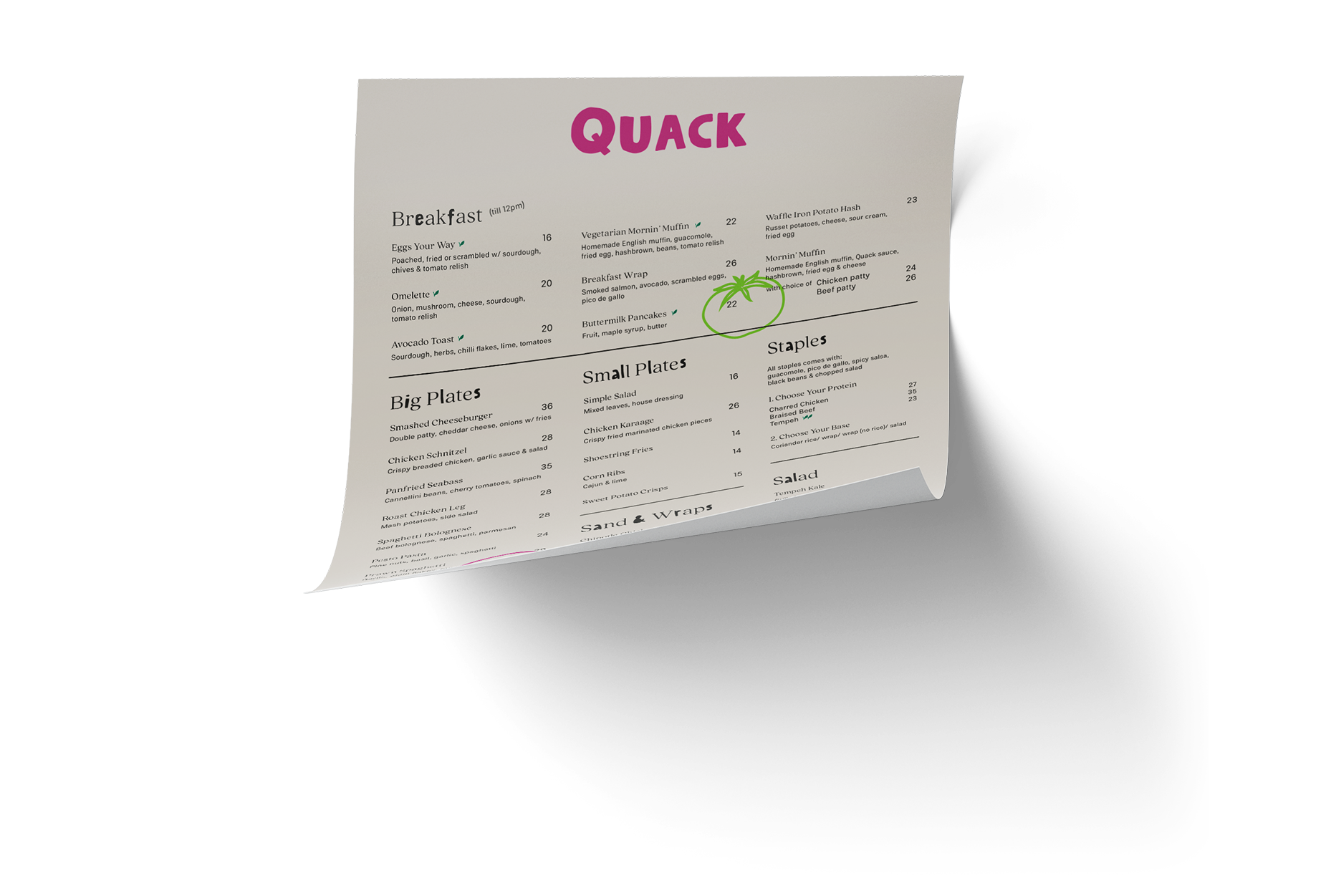
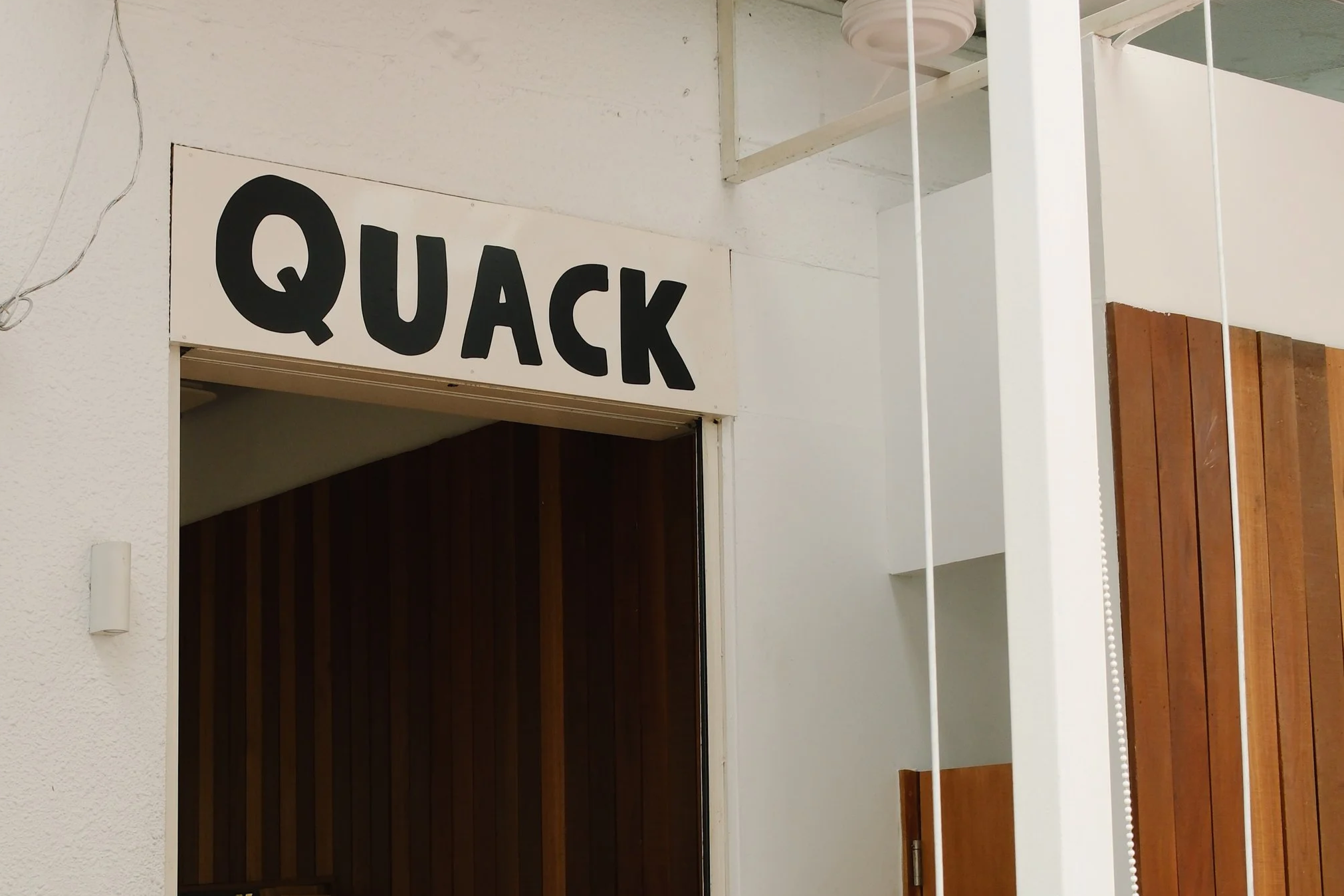
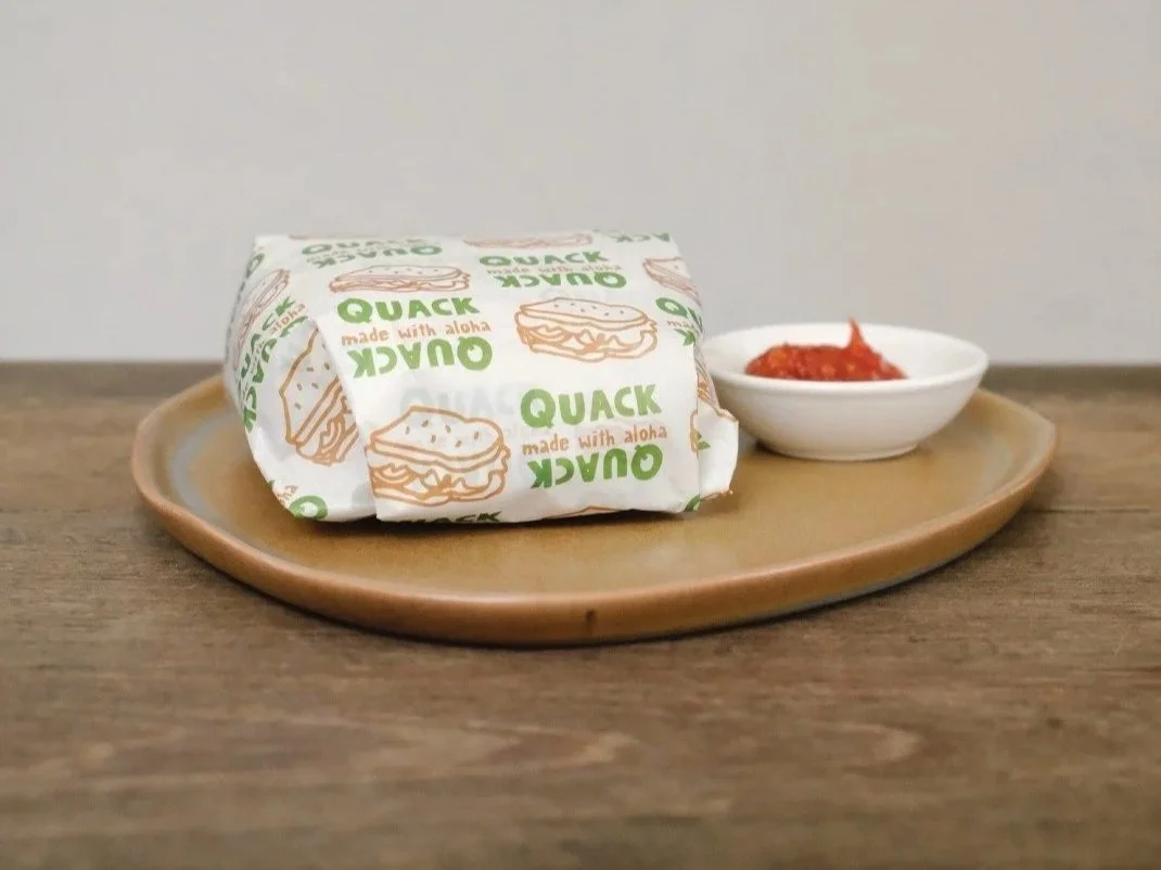
Quack
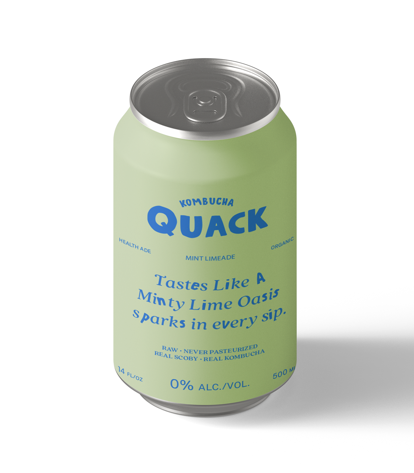
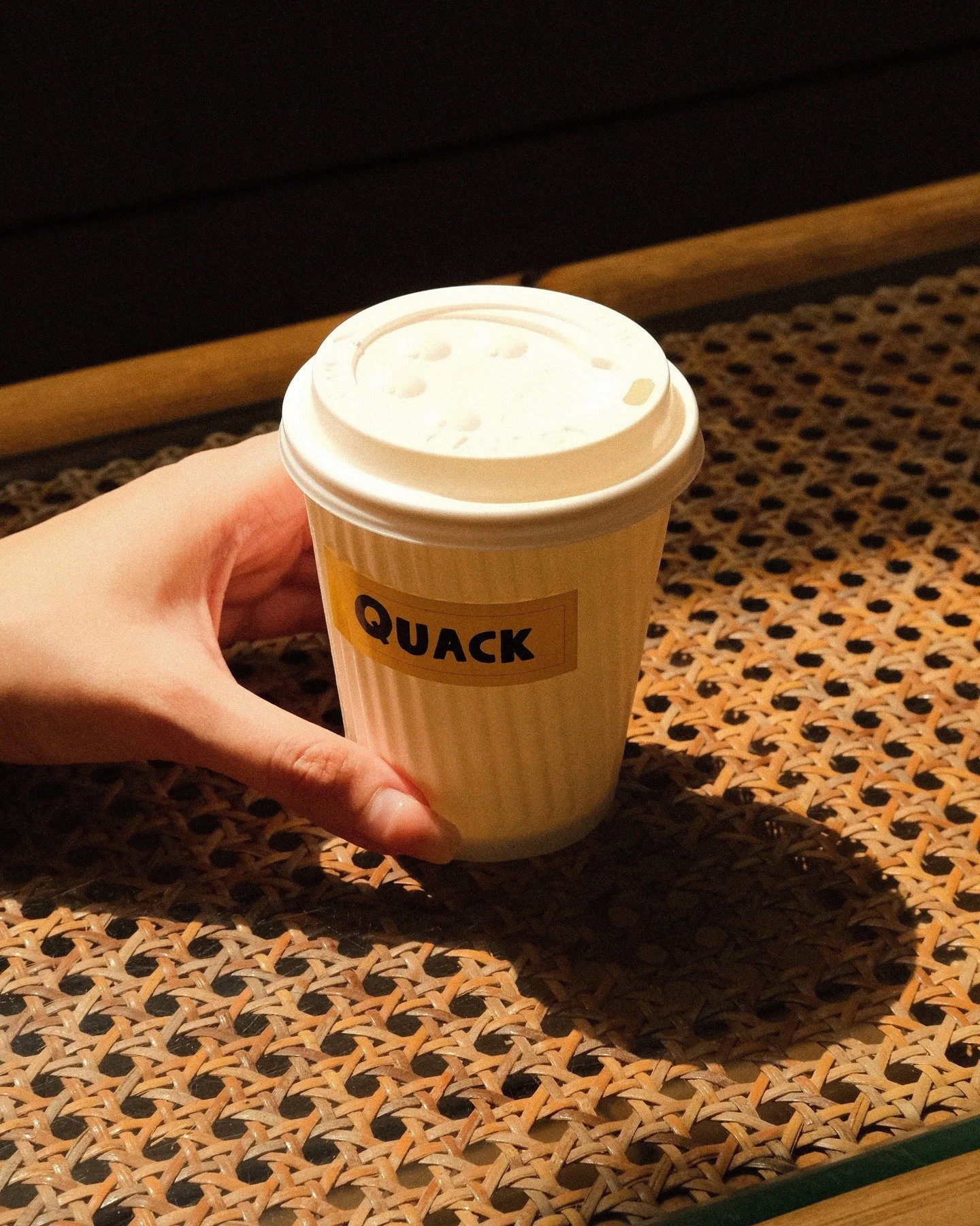
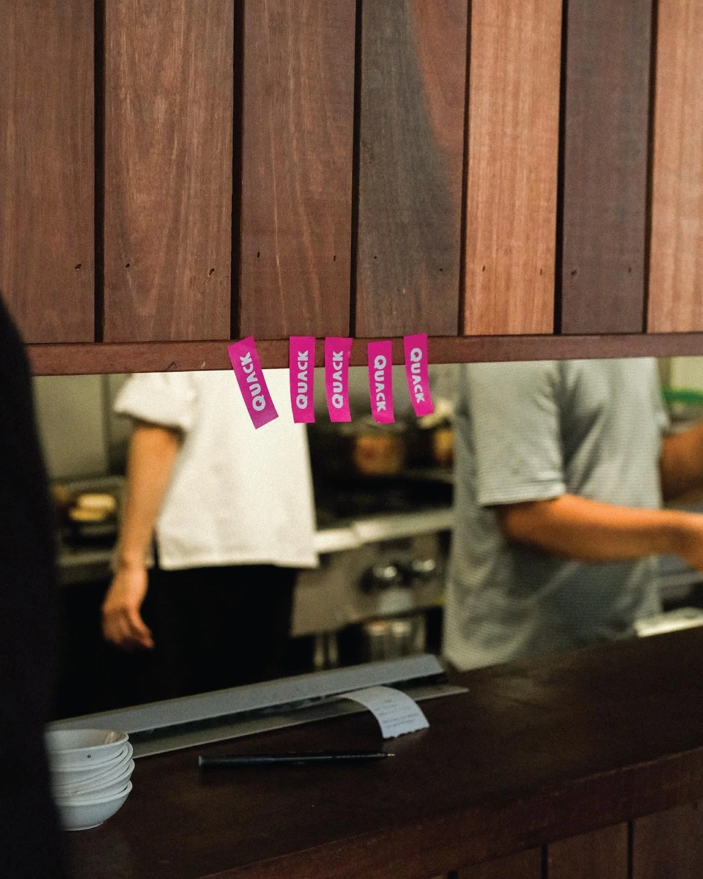
When we were first approached by Rubberduck, the task was to distill the brand down to its essence. It was a business direction that moved against the usual instinct to scale and expand. It was reimagined as something old yet not the same: Quack. We reshaped Rubberduck’s identity into a punchier, more playful look while preserving its core spirit.
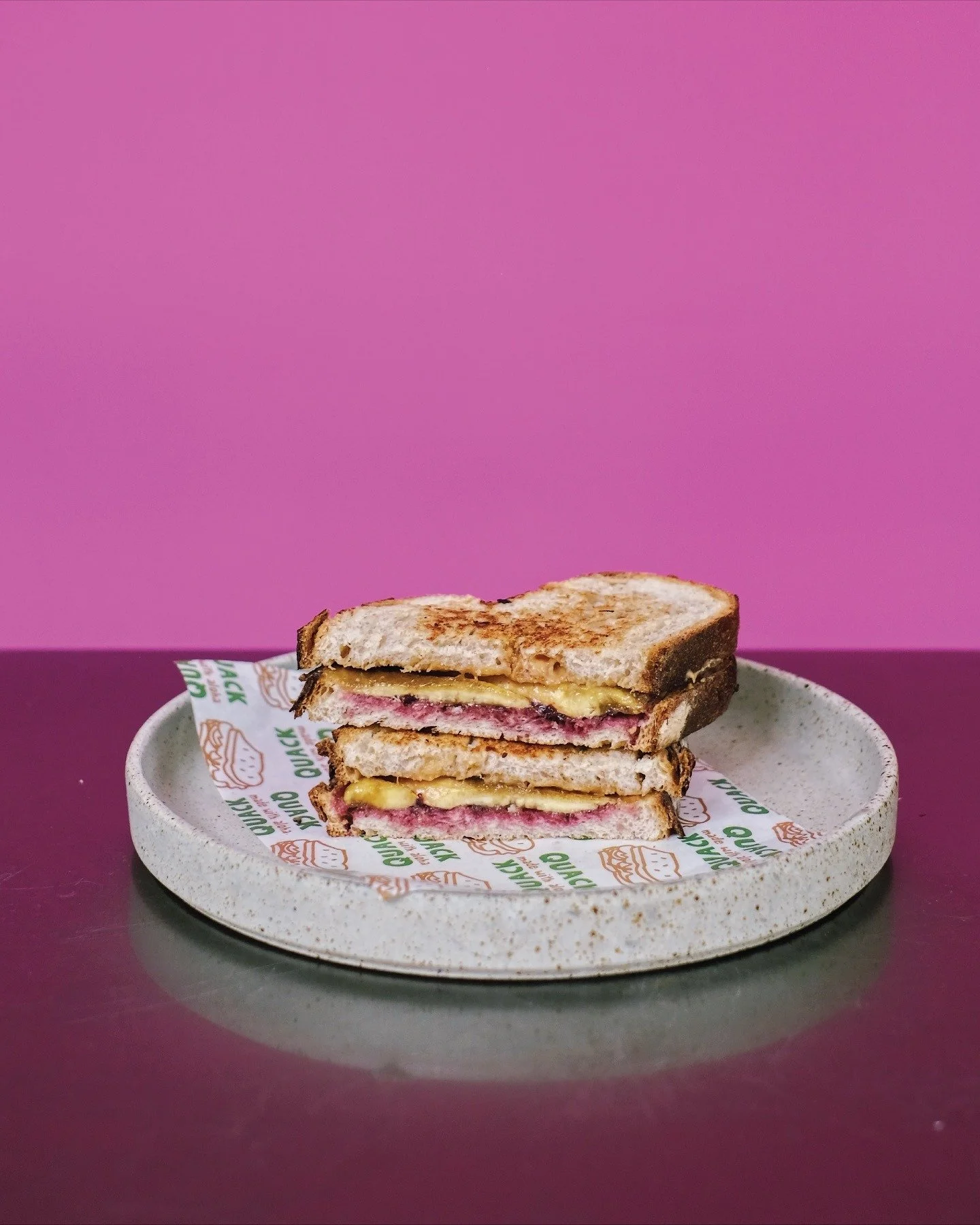
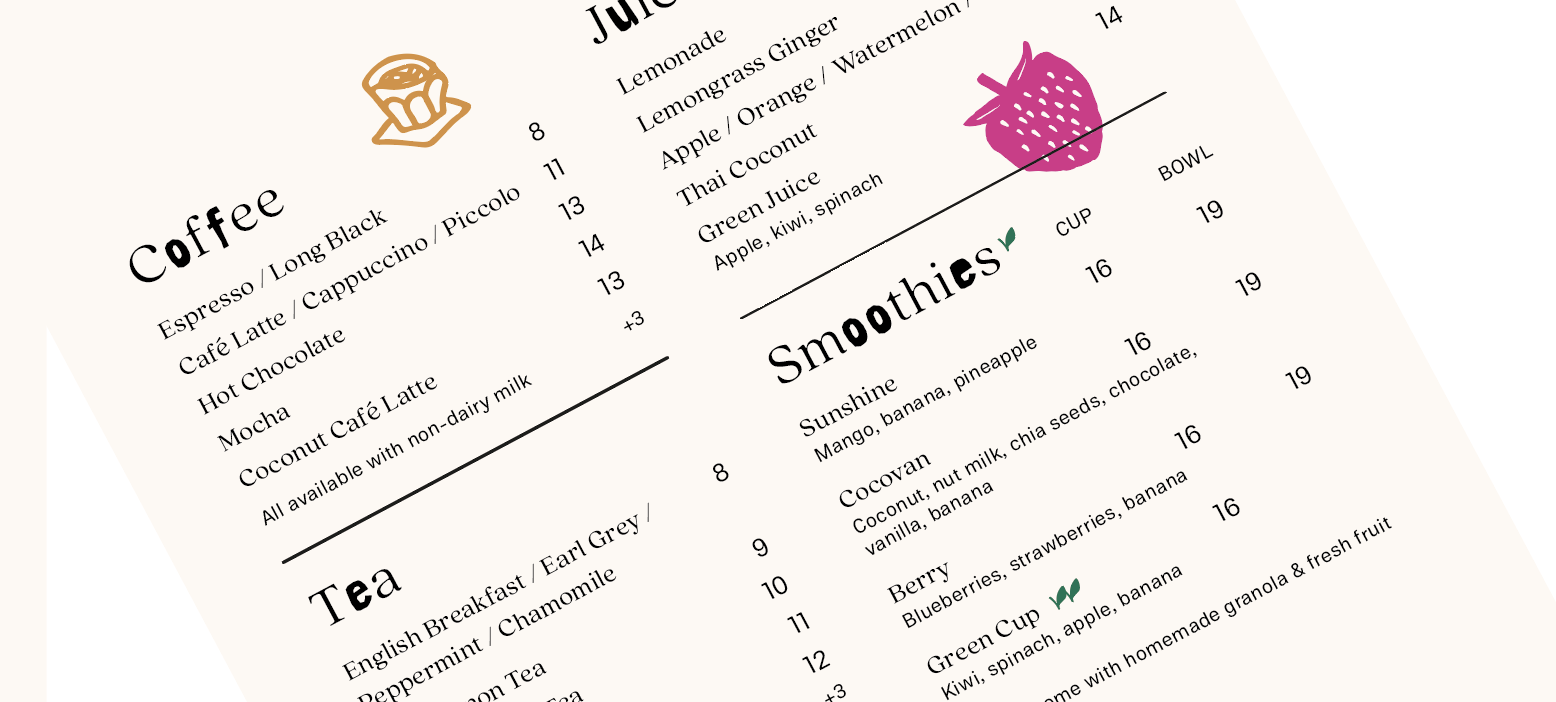
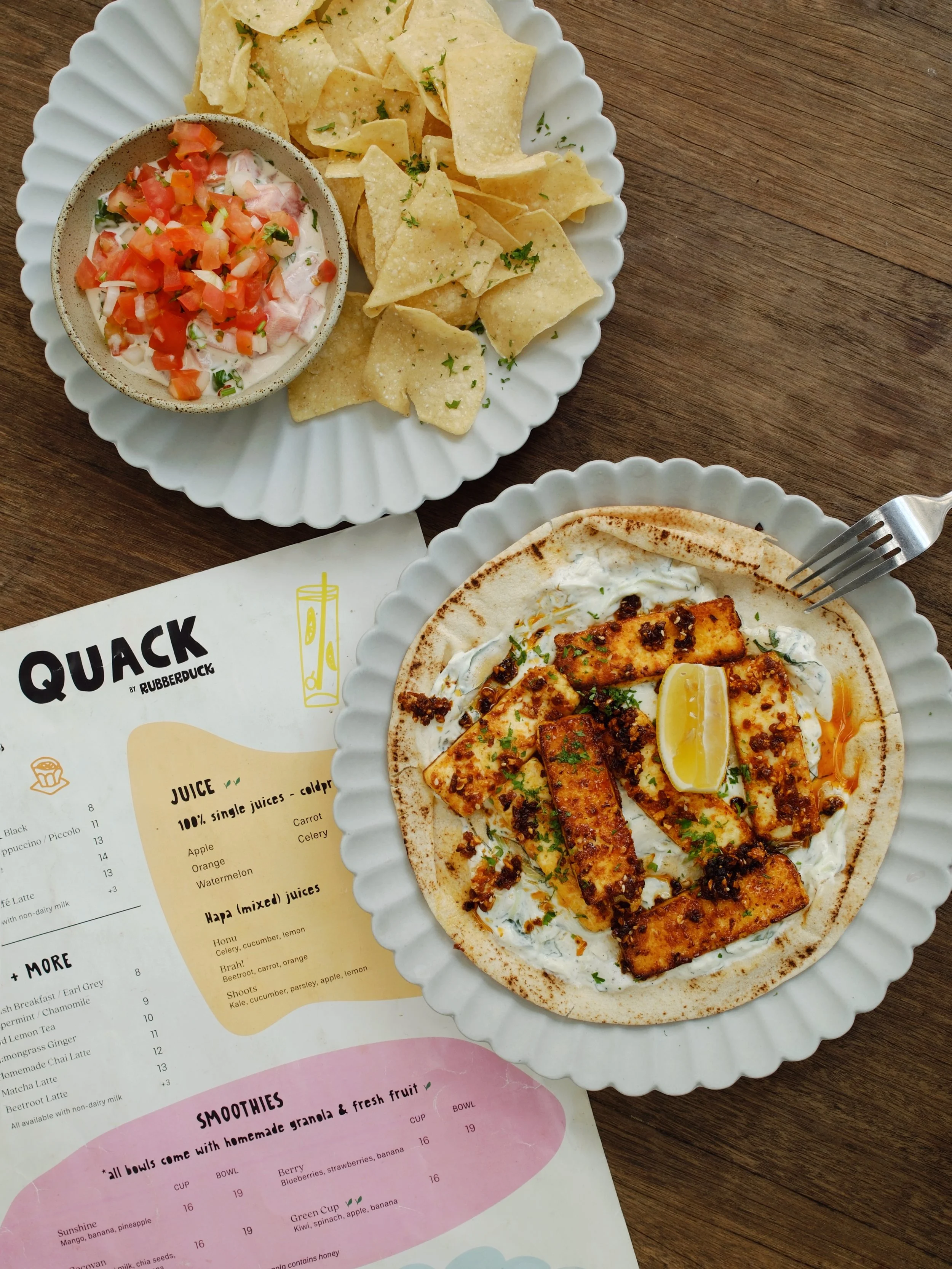
In shaping Quack, we wanted to retain the brand’s natural quirk while translating the joie de vivre of its owners into the identity. Lin and Katrina are energetic, positive, and lively, with an ease that feels infectious. This informed our approach to both colour and typography, leaning into a sense of brightness and movement. There is also a contrast that defines them: they are unserious in energy but grounded in conviction. That balance became central to the brand — something expressive yet assured; playful, but never careless.
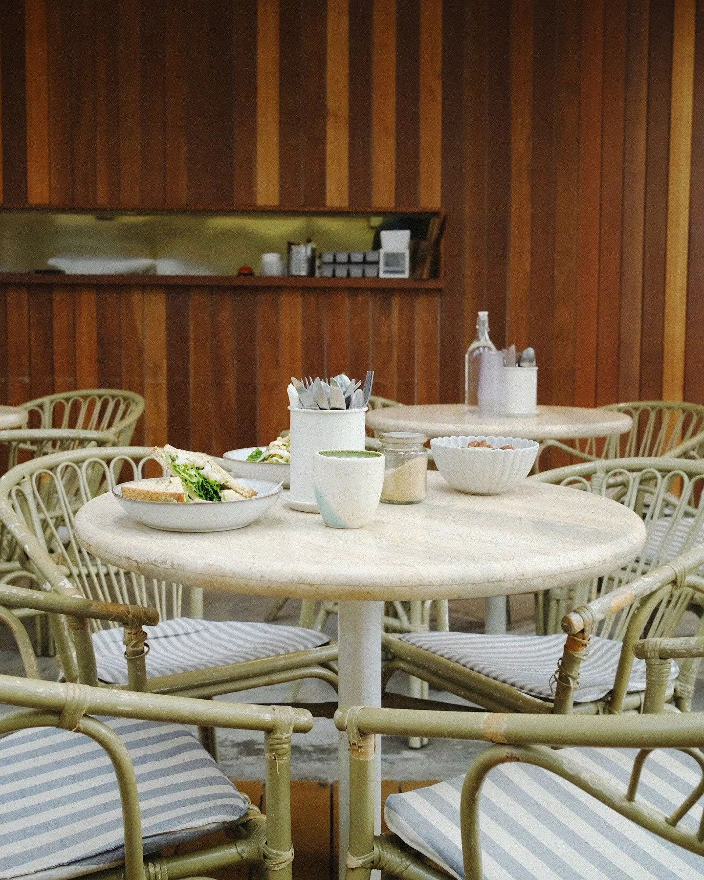
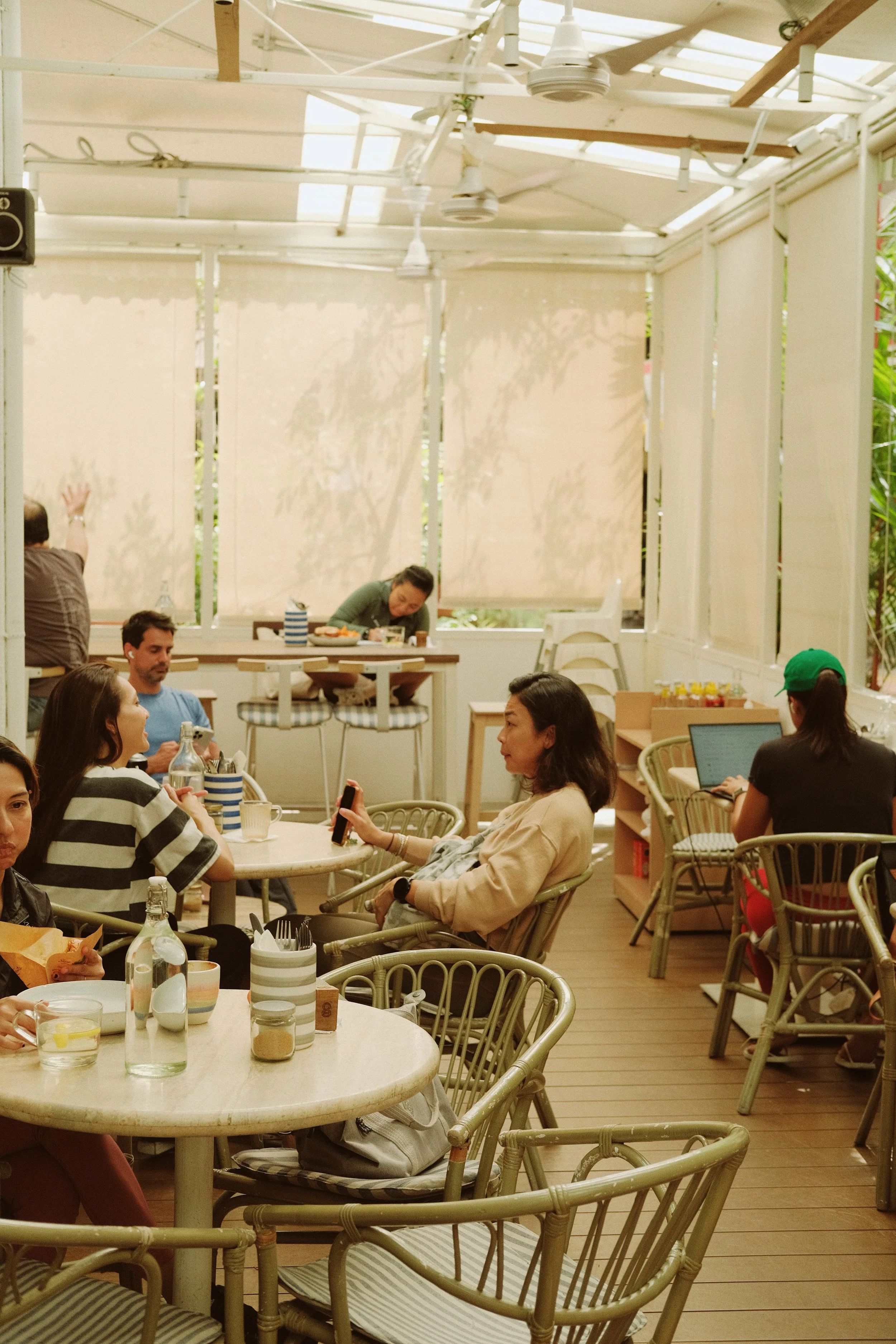
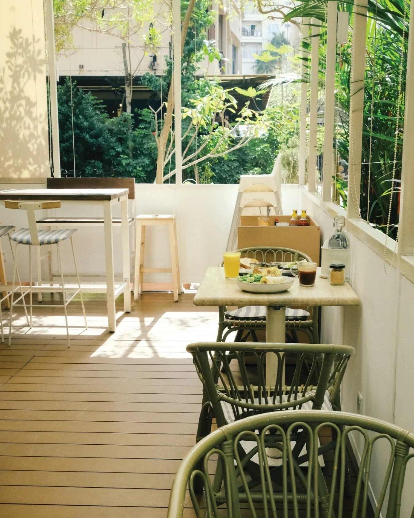
Beyond its visual language, Quack is shaped by Katrina’s time in Hawaii, a laid-back, welcoming sensibility that puts everything at ease. That Aloha spirit is already baked into their space, and the brand identity simply visualise it.
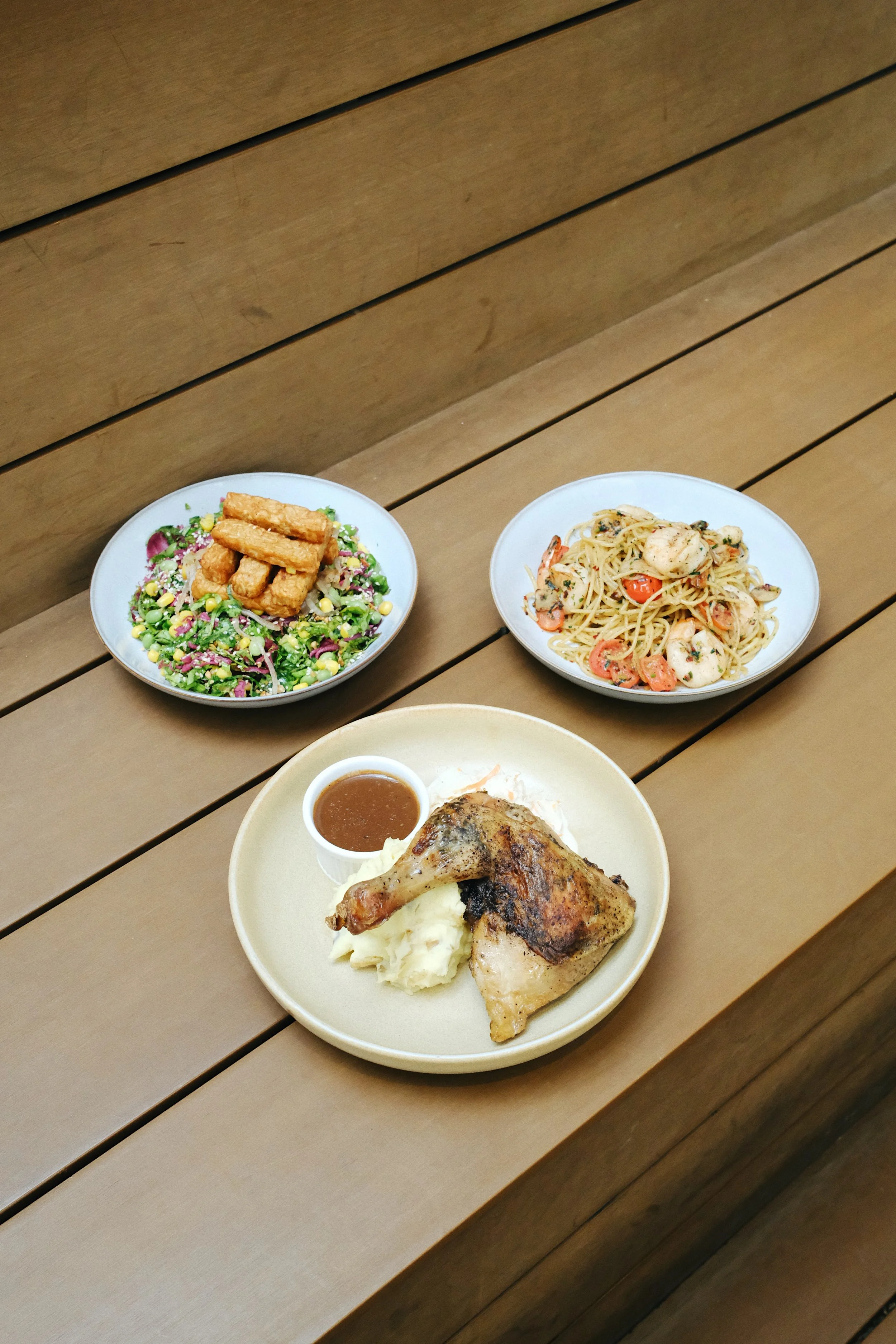
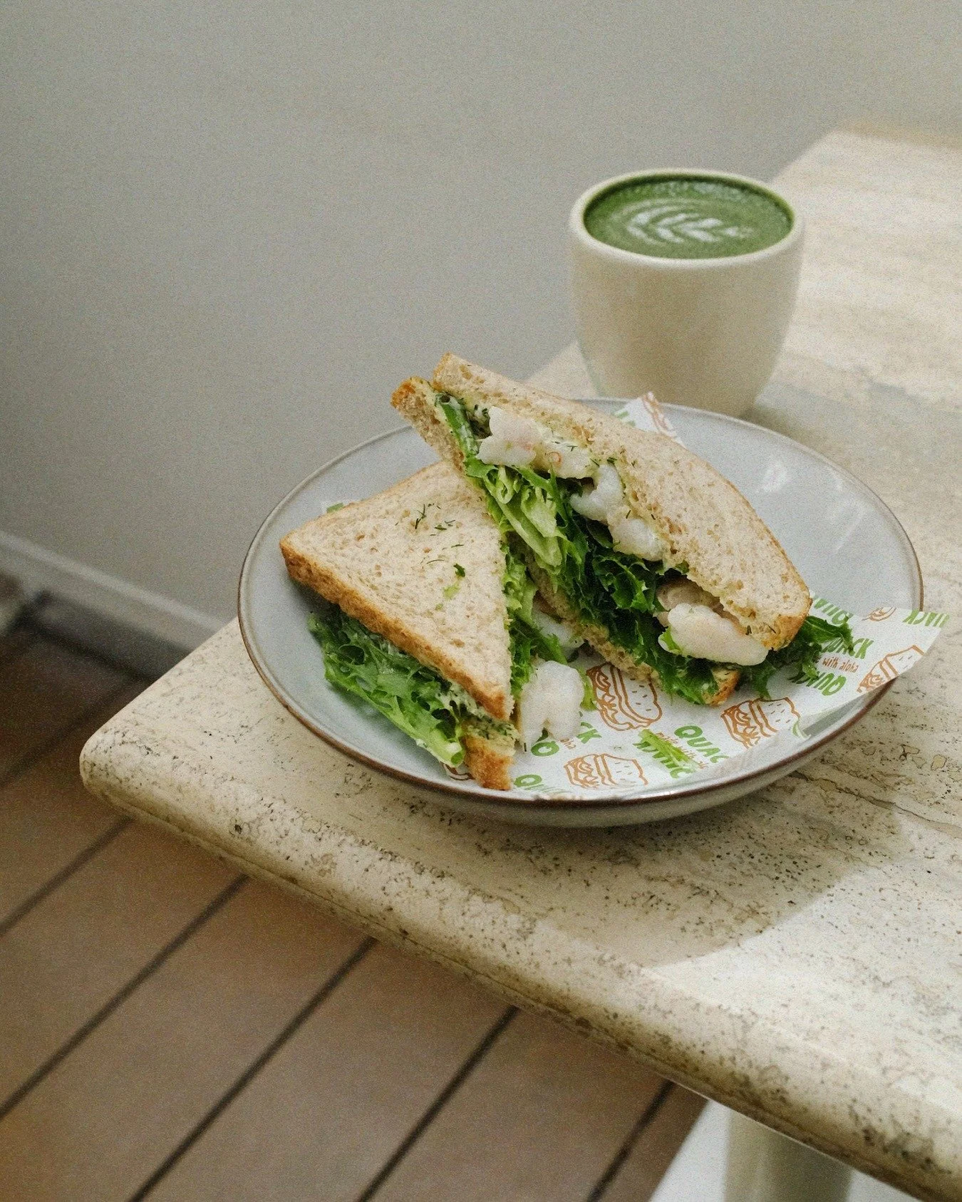
Images courtesy of Quack & Simora Studio
Scope: Brand Identity
Client: Quack by Rubberduck
Completed: March 2024